Milan Art — Social Network for Artists
A social platform for Milan Art Institute, a large US art school. We turned an offline community into an online one, from the design system to the launch in production.
- Role
- Product Designer → Design Lead
- Period
- Mar 2022 — Jan 2024
- Team
- Up to 5 designers
Context
Milan Art Institute is a major art academy based in Georgia, US, with a large community of students and teachers. The school decided to move that community online and build its own social network for artists: a feed where artists share their work, follow each other and comment, plus a library of courses and live painting sessions from the school’s teachers.
It was a true product environment: a large design system, dozens of flows, motion, and careful iteration together with the CEO and developers.
Launch
We took the platform all the way to production. Here is the announcement video the school made for the launch, with the founders, teachers and students talking about the product.
Three design systems
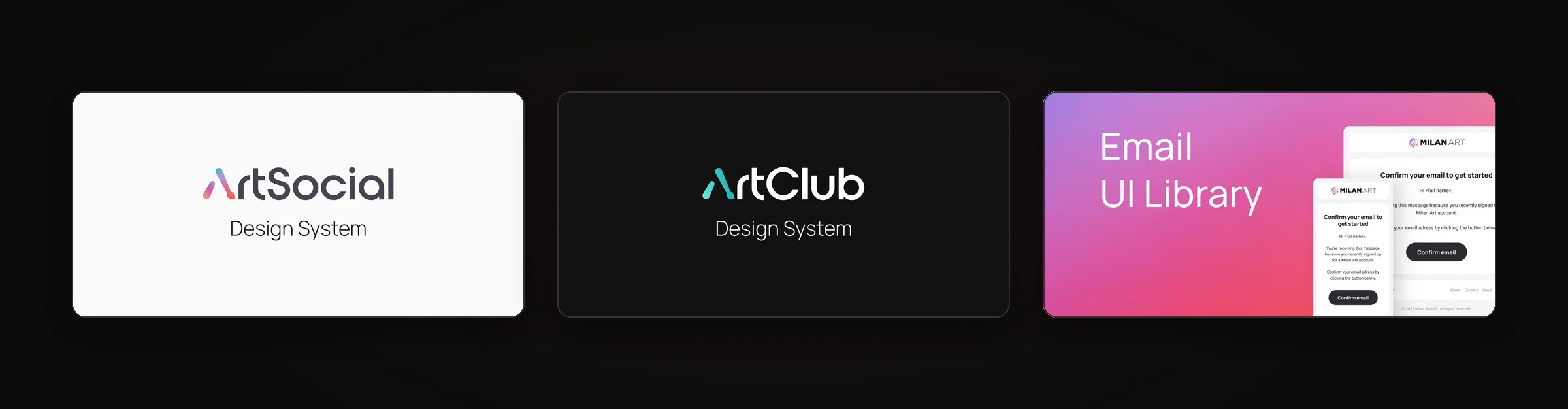
Before scaling the product, we built the foundation. Over time it grew into three connected libraries: the main ArtSocial system for the social network, a dark ArtClub system for the paid club, and an email library so that every letter the platform sends looks like part of the same product.
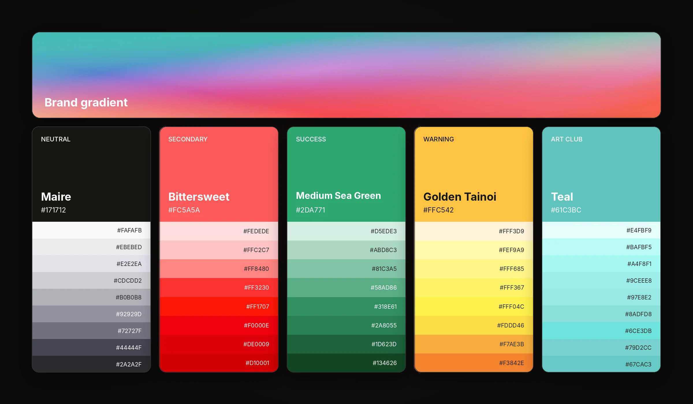
The palette is built for an art audience: neutral grays let the artworks lead, while bright secondary colors and gradients carry the brand. Art Club got its own teal accent on top of the same base, so the two products feel related but distinct.
The social feed
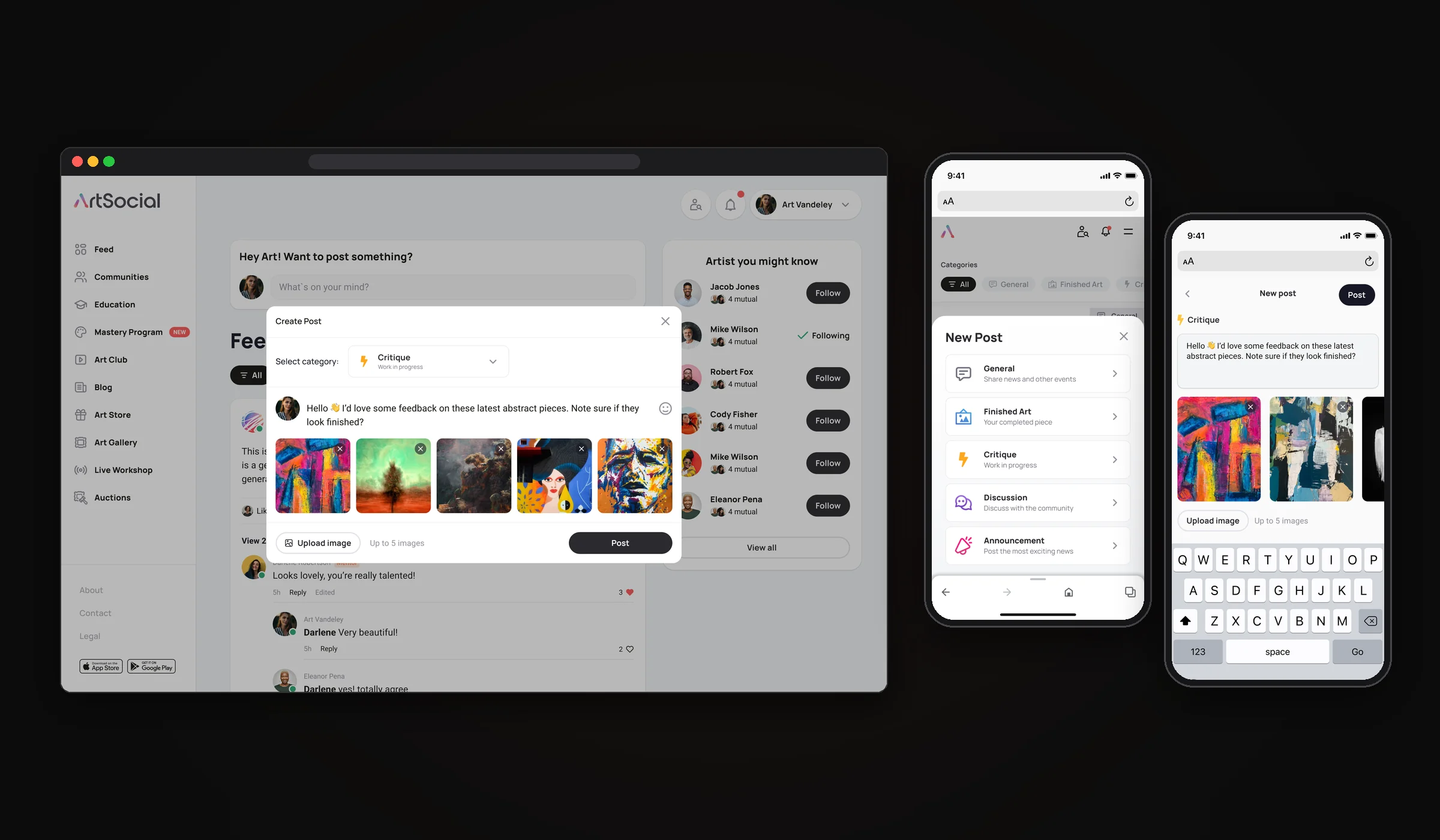
The heart of the product. Artists post finished work, works in progress and requests for critique, follow each other and switch between their own Feed and Explore, where they discover new authors. Every post has a category (General, Finished Art, Critique, Discussion or Announcement), so the feed can be filtered by what you came for. Mentors are marked in the comments, and the side panel suggests artists and communities to join.
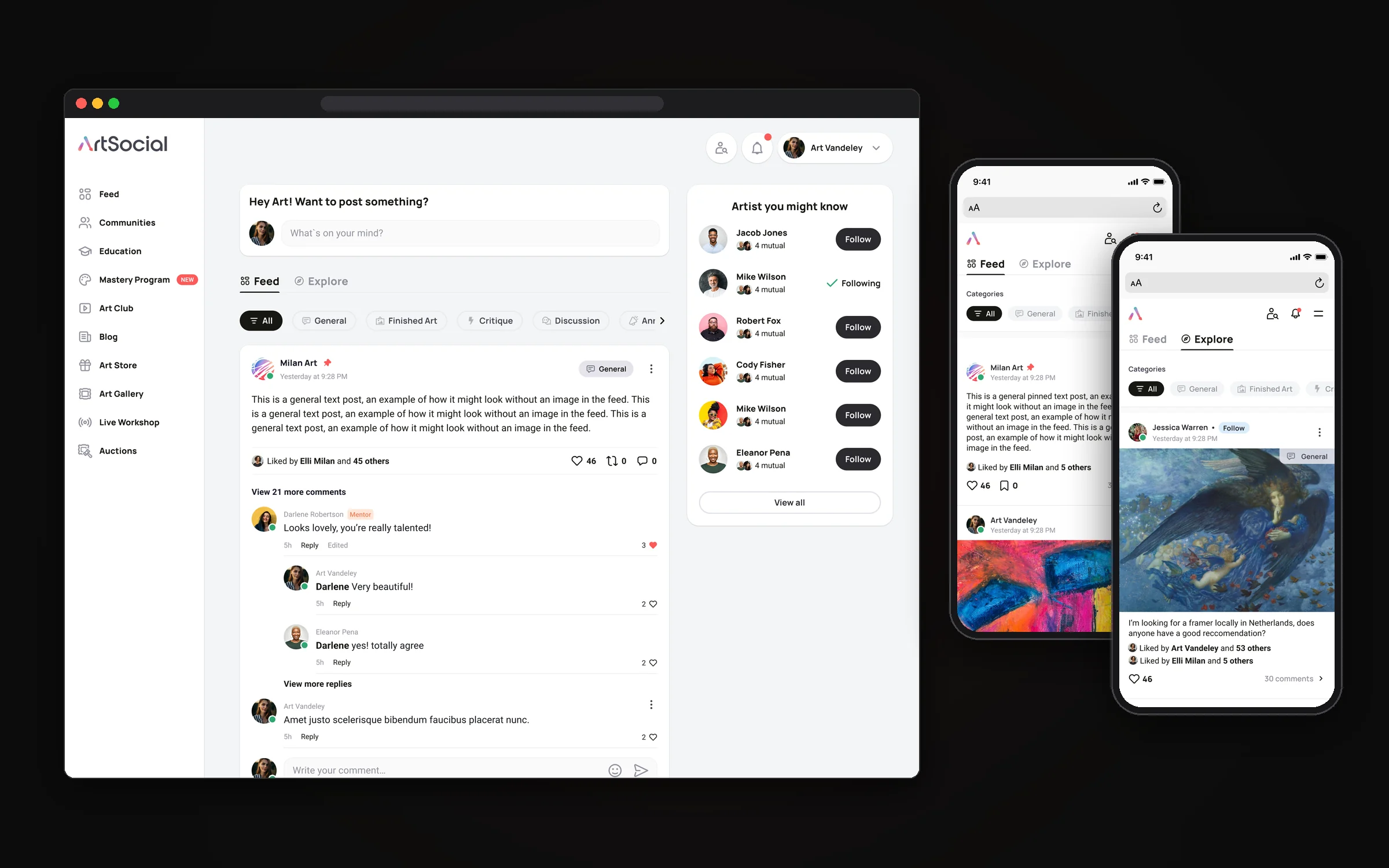
Posting takes a few taps: pick a category, write a few lines, add up to five images, and the post appears in the feed with a confirmation. On mobile, the category is chosen first from a bottom sheet, so every post lands in the right place.
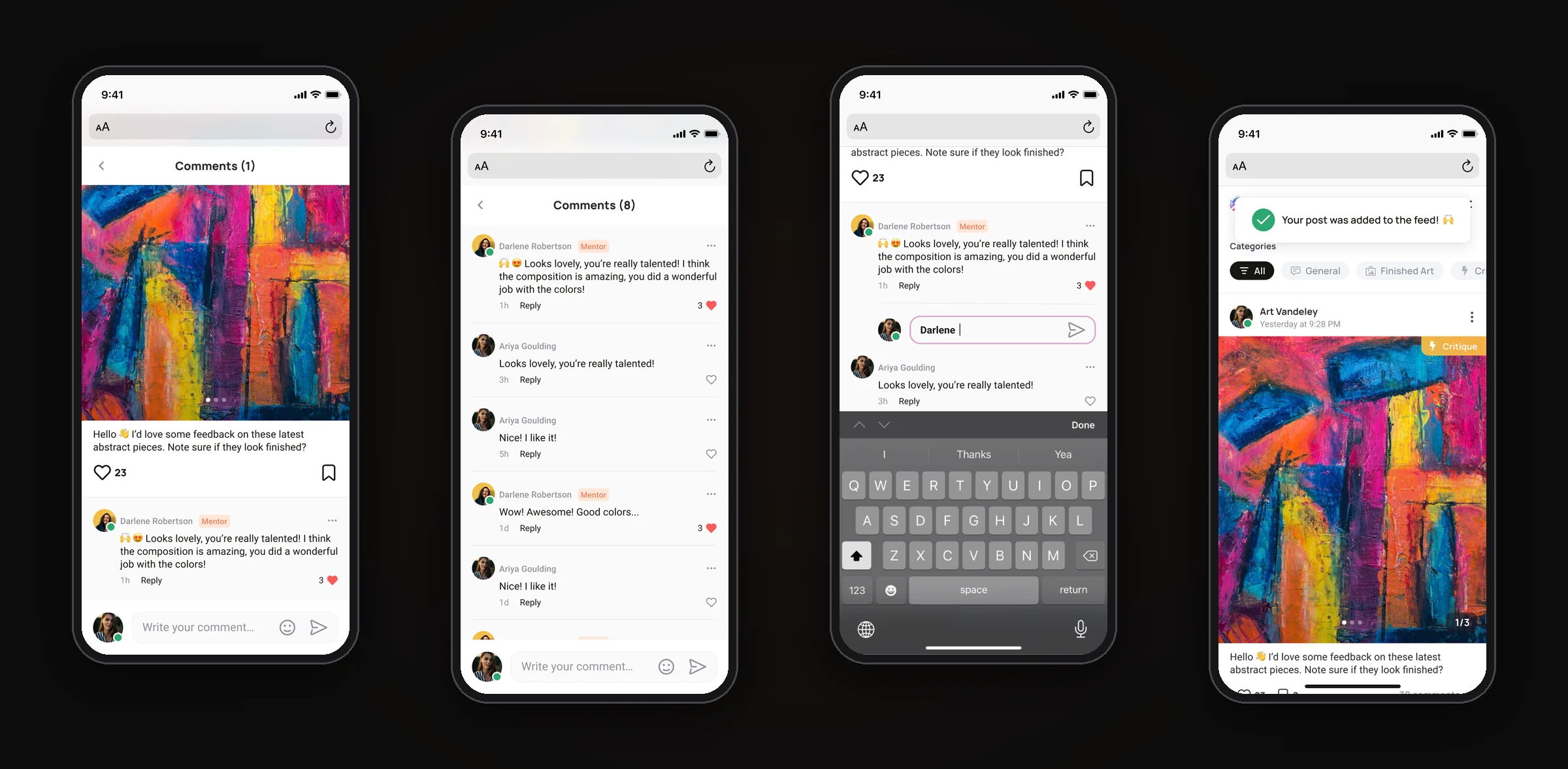
Feedback is what artists come for, so comments got as much attention as posts: threaded replies, mentions, likes on comments, mentor badges and a comment field that stays above the keyboard.
Communities
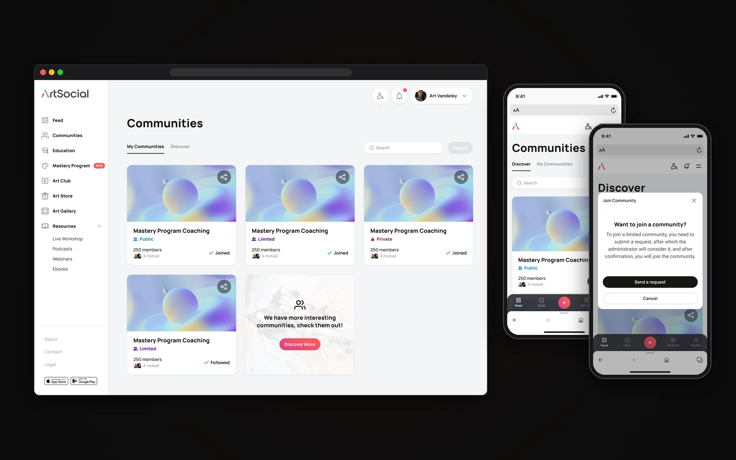
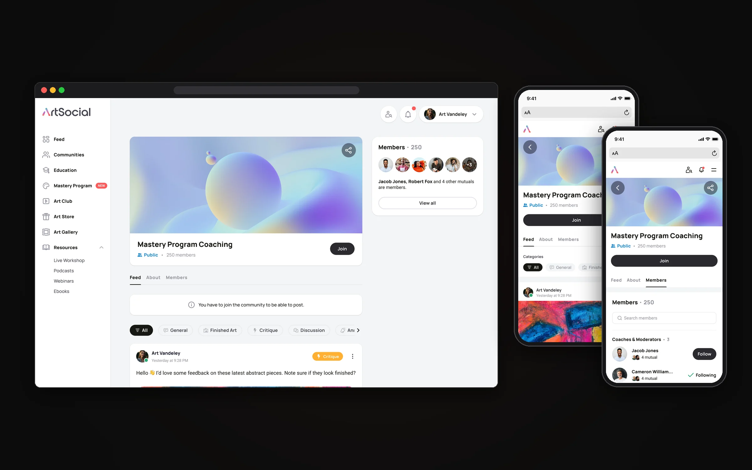
Around the feed we built communities: spaces for a program, a coaching group or simply artists with a shared interest. Each community is Public, Limited or Private, and that one setting drives the whole flow. Anyone can join a public community, a limited one asks for a request that the moderators approve, and a private one is invisible until you are invited or accepted.
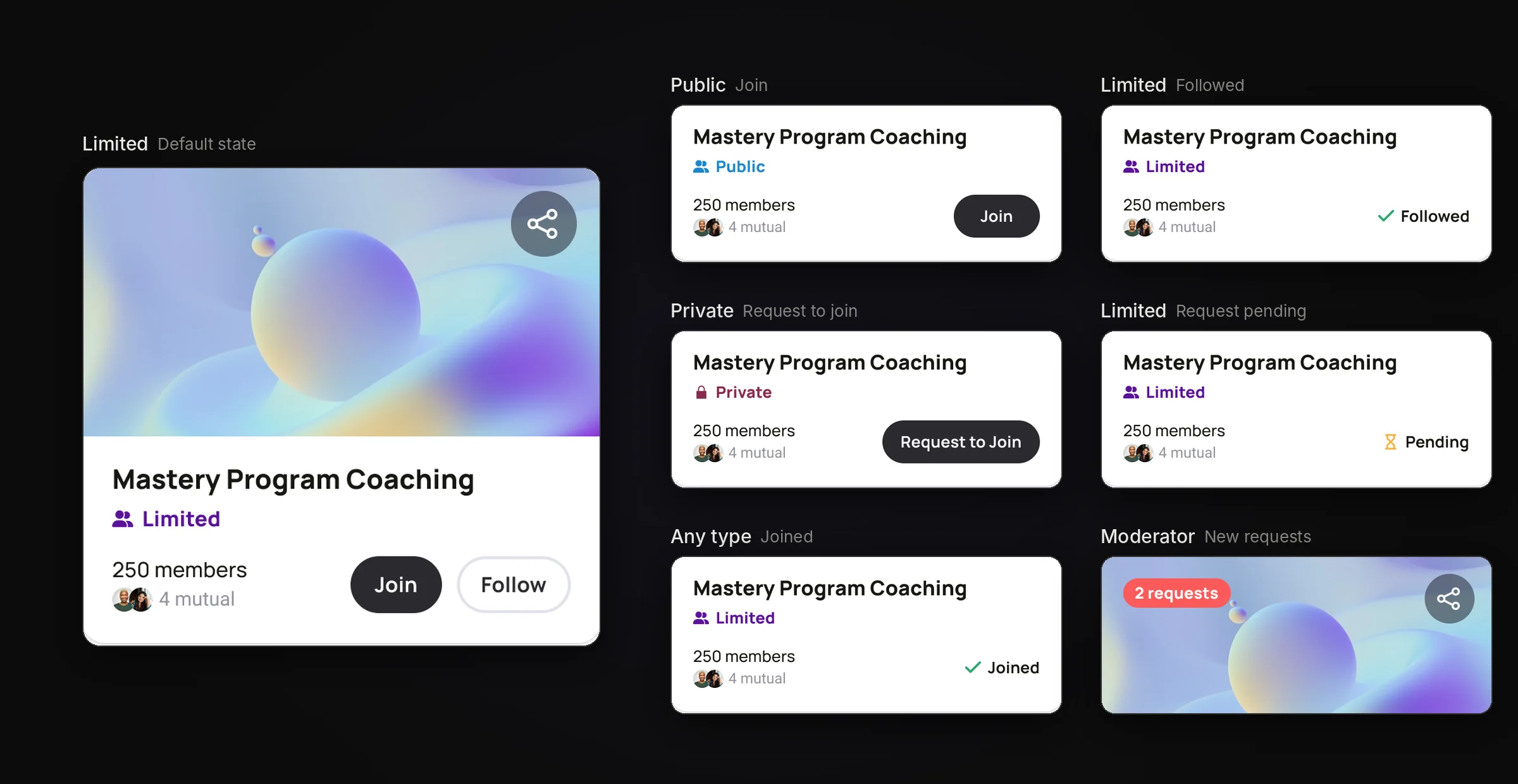
Every card had to show where the user stands at a glance, so we designed the full matrix of states: default, joined, followed, pending, and incoming requests for moderators.
A community page has its own feed, an About tab and a members list with coaches and moderators on top. Only members can post, and visitors see exactly what they need to do to take part.
Blog
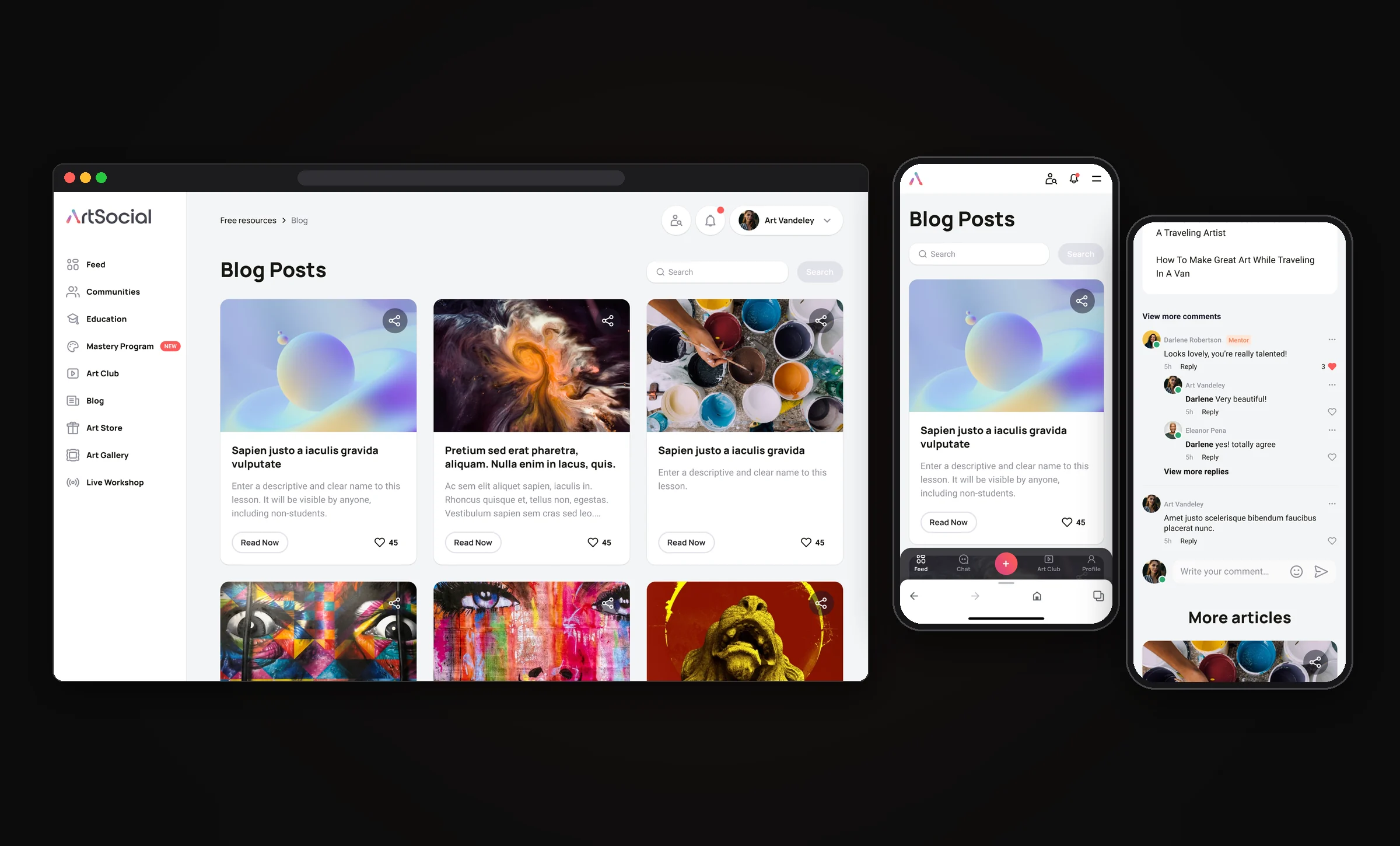
The school publishes free articles on technique, materials and the life of an artist. The blog shares the feed’s building blocks: the same cards, likes, sharing and threaded comments, so reading an article feels like part of the community rather than a separate site, and every article leads into more reading and into the paid programs.
Chat and safety
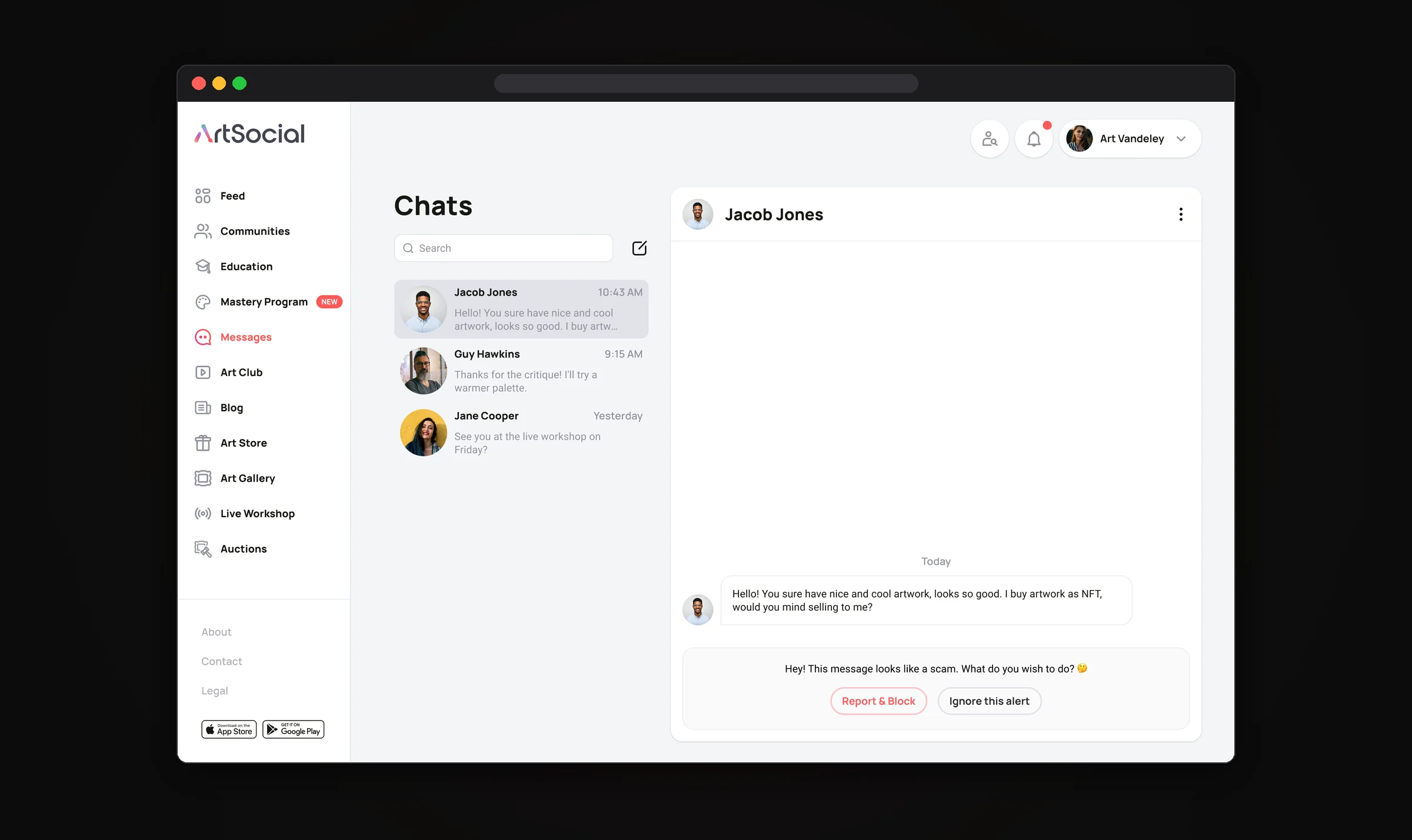
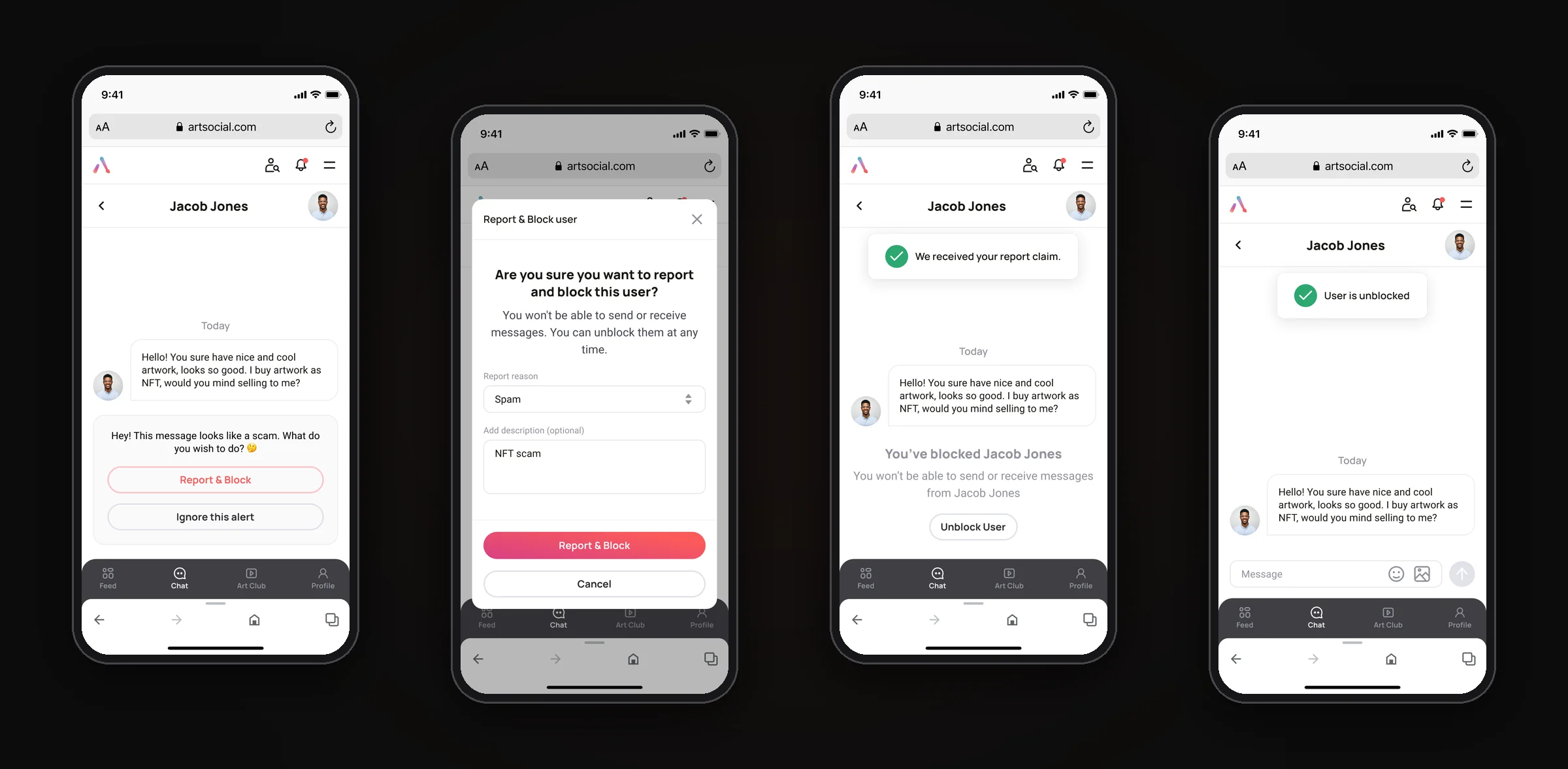
Artists message each other directly, and an open community of artists also attracts scammers, most often with fake NFT offers. So the chat does not just deliver messages: it flags suspicious ones and offers to report and block the sender in one step, or to ignore the alert. A blocked user can be unblocked at any time, and every step ends with a clear confirmation.
Profile and settings
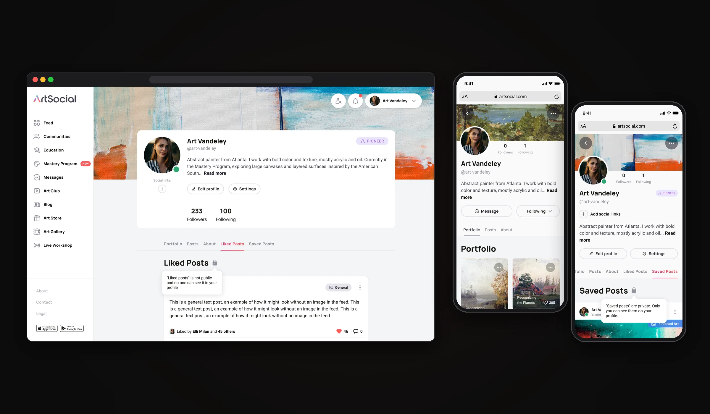
The profile is an artist’s portfolio inside the network: a cover, bio, social links, followers and tabs for portfolio, posts, liked and saved posts. Private tabs are marked with a lock and a short hint, so nobody wonders who can see what. Visiting someone else’s profile, you can message them, follow them, or report and block them.
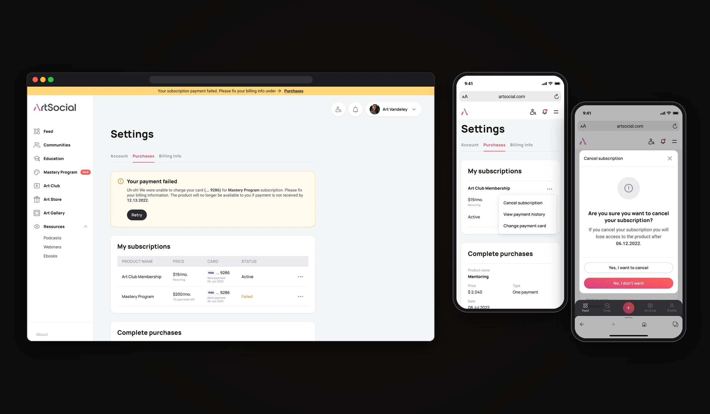
Settings keep every subscription and purchase in one place. A failed payment shows up as a banner across the app and a clear card with a retry button, and cancelling a subscription goes through a menu, a confirmation that says exactly when access ends, and an undo.
Online courses
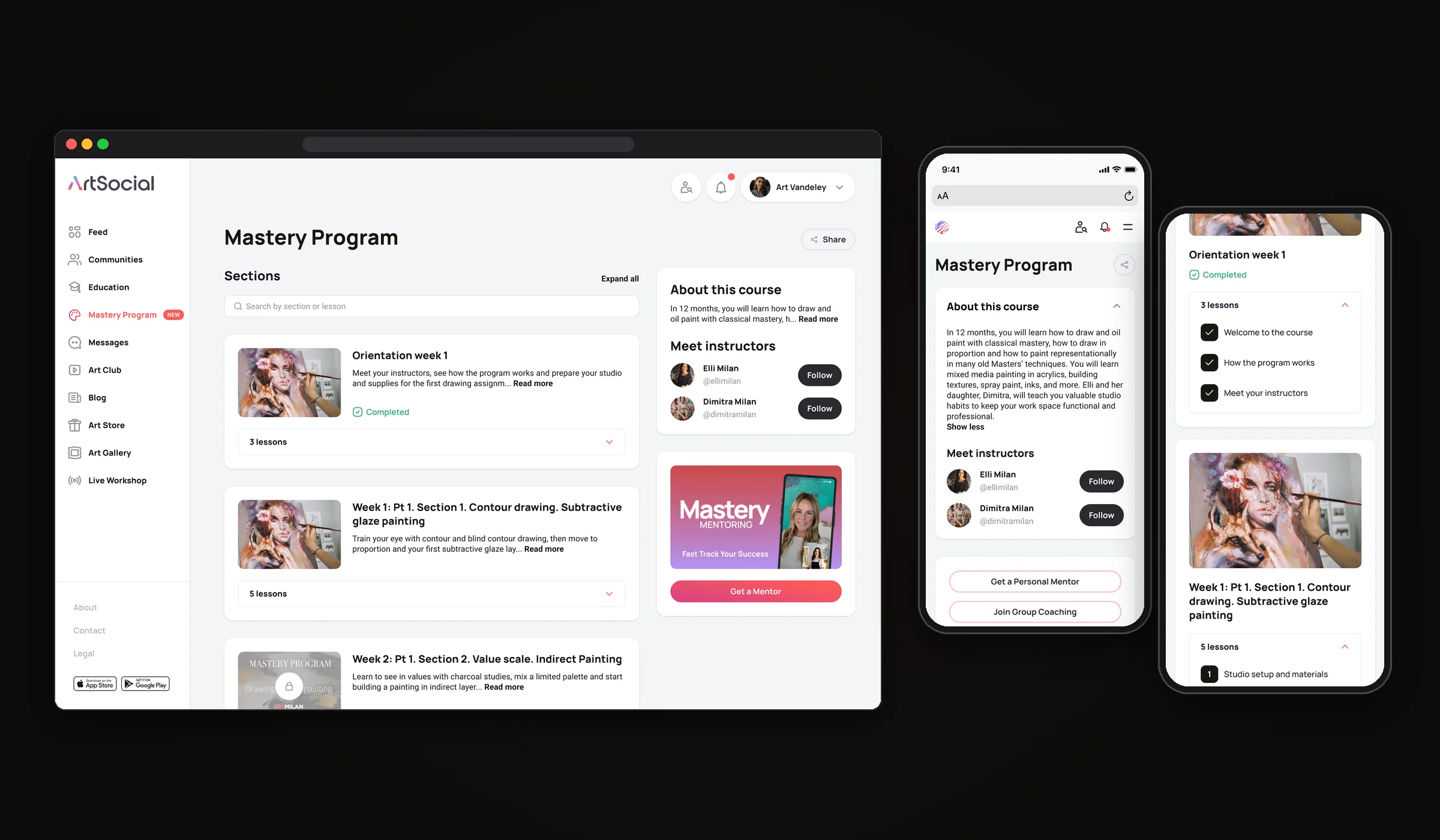
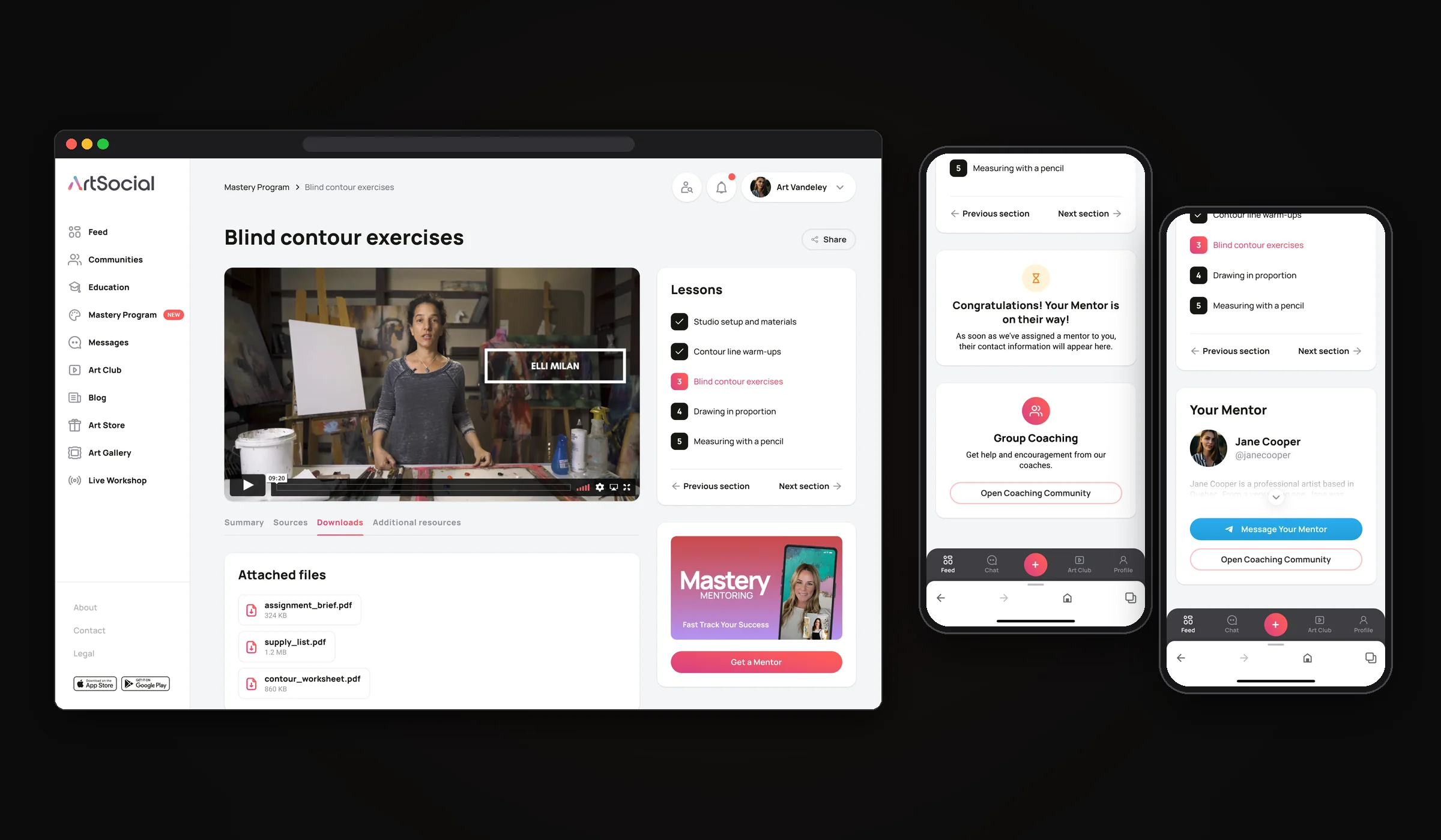
The Mastery Program is a year-long course built into the same social network. The course page shows sections with progress, locked weeks and the instructors, and every lesson keeps the video, the lesson list and the files in one place. On mobile we added the mentor flow right into the lesson: offer a personal mentor, show that one is on the way, then show the mentor with a direct message button.
Mentors
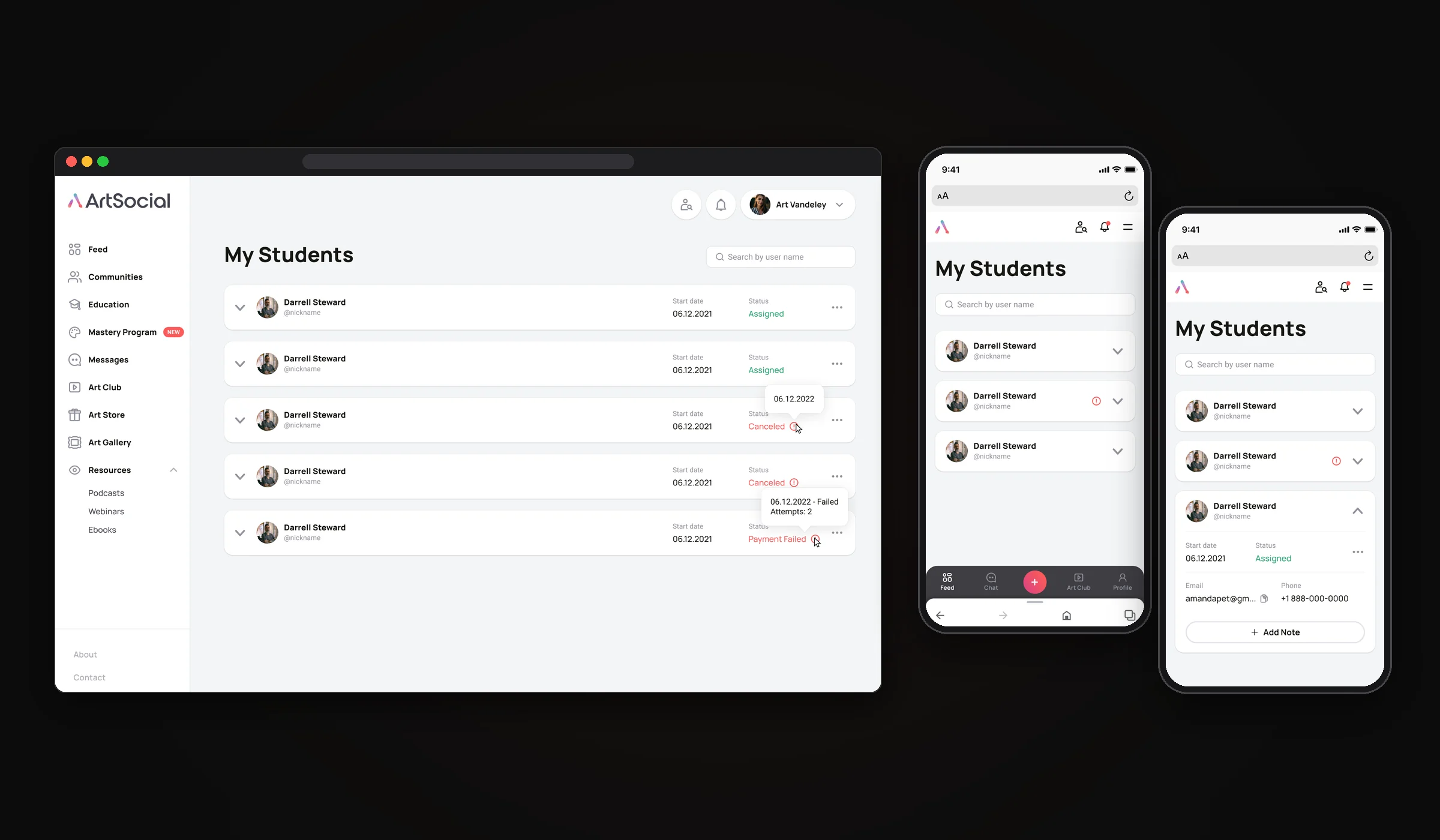
The Mastery Program pairs every student with a personal mentor. Students see who their mentor is and can message them or open their coaching community right from the feed. Mentors get their own workspace, My Students: every student with a start date and a status (assigned, canceled or payment failed, with the details in a tooltip), plus contacts and private notes in an expandable card.
One brand, many products
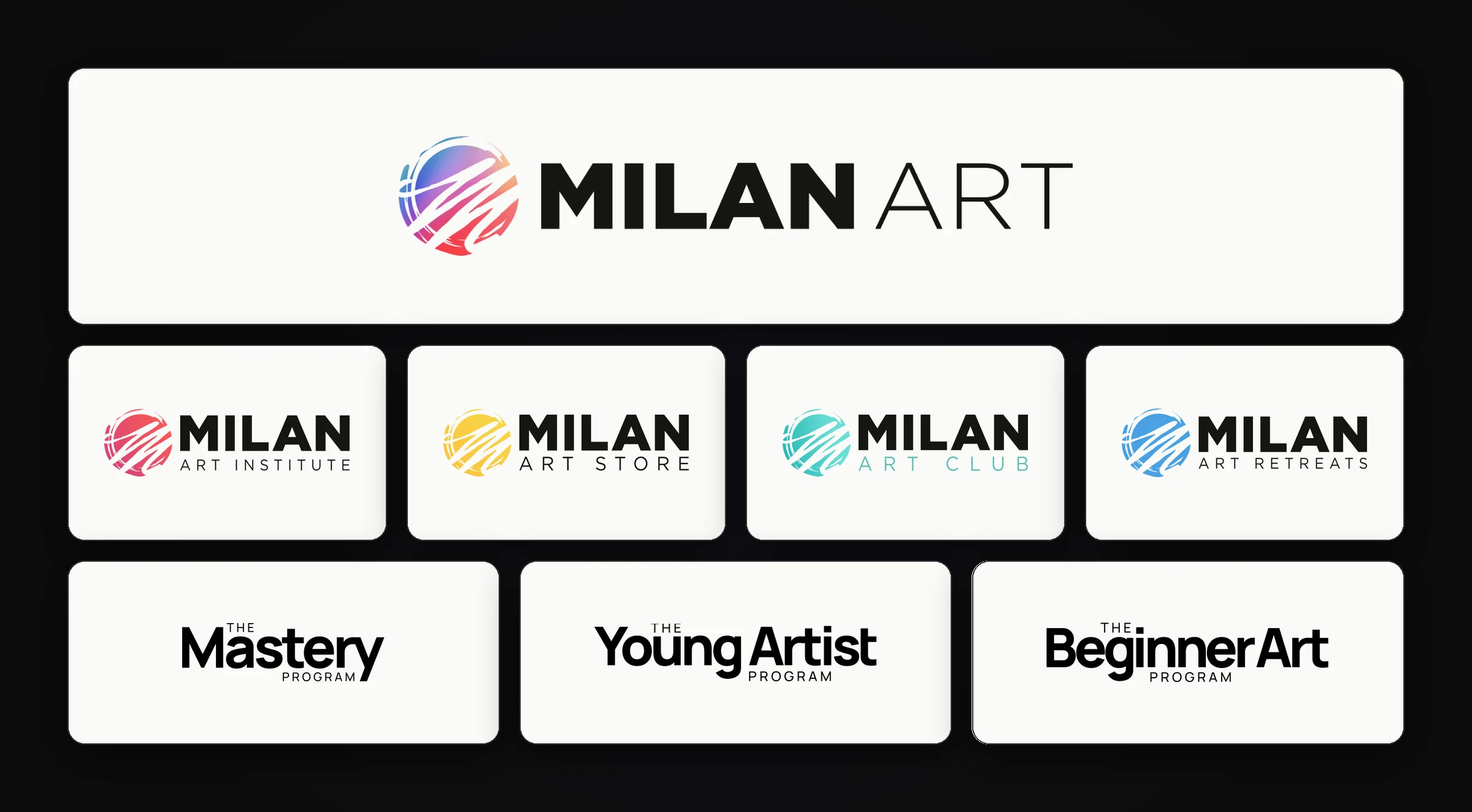
Milan Art is a family of products: the institute, the art store, the club, retreats and several learning programs. We brought all the marks into one logo system: a shared sign with its own color for each sub-brand, and a single typographic style for the programs.
Art Club
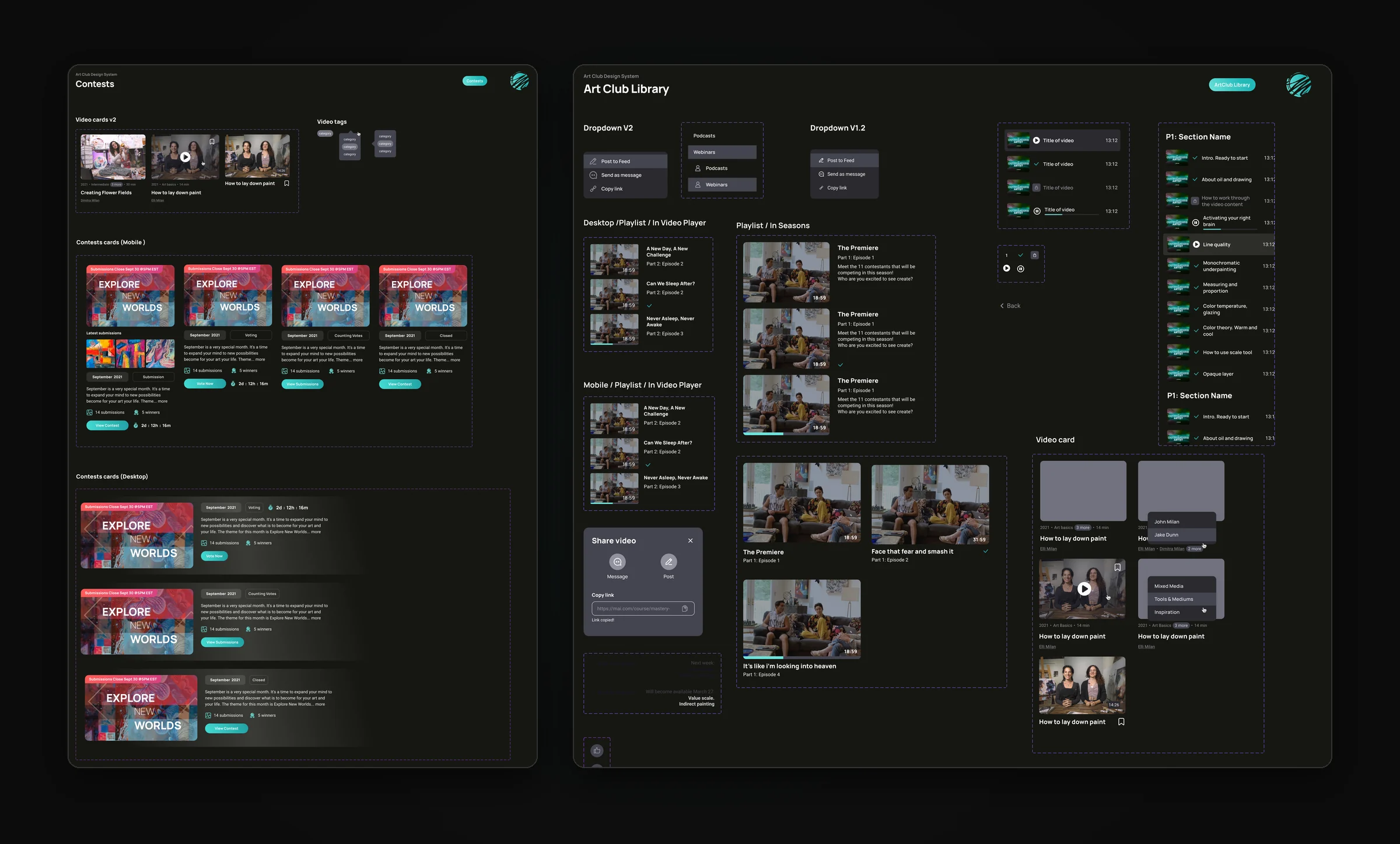
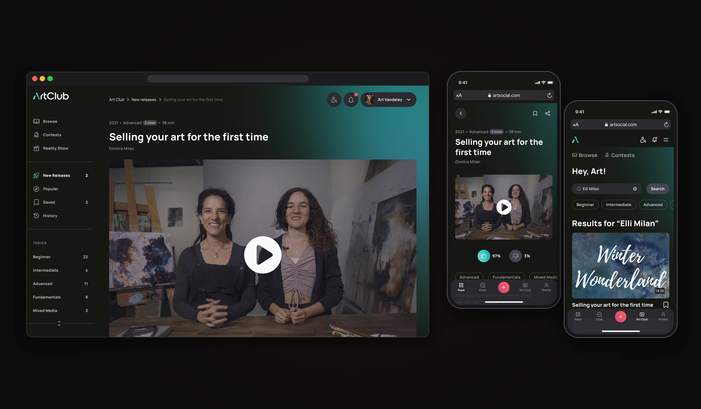
Art Club is the paid part of the platform: a closed club for artists with trainings, live streams and monthly contests. It runs on its own dark design system on purpose: Art Club is a separate premium space, and the dark theme visually sets the paid club apart from the main social network. As a bonus, video and artworks stand out better on dark. We designed the video library with playlists and seasons, course progress, and contest cards for every stage, from submissions to voting and winners.
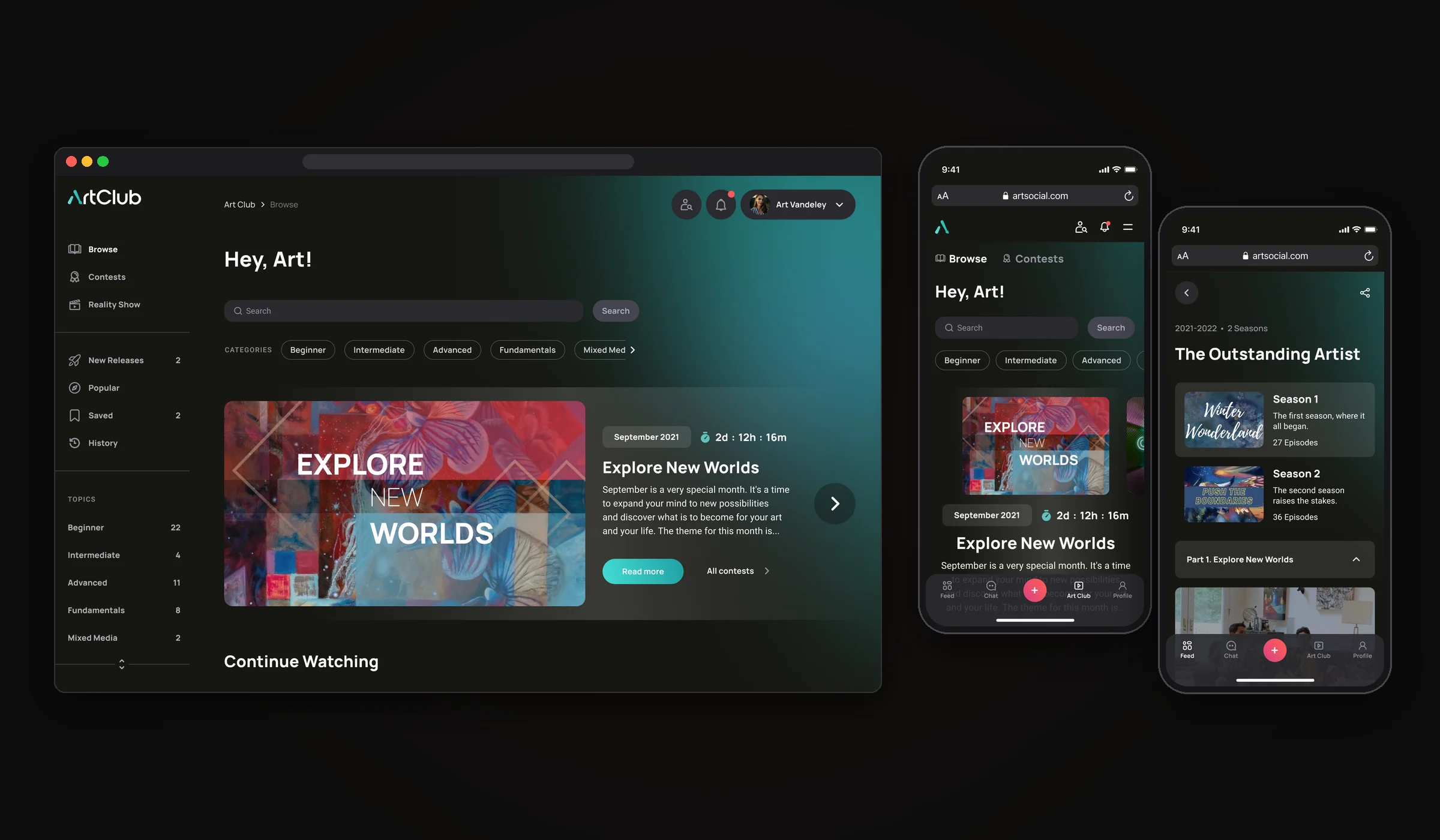
The club opens on a personal home: search with skill-level filters, the current contest with a countdown, and the videos you haven’t finished. The school’s own reality show, The Outstanding Artist, lives here too, split into seasons and episodes like on a streaming service.
Every lesson has its own page: the video, the topics, quick likes and a place to save it for later. On mobile the video stays on top and the bottom bar keeps the rest of the social network one tap away.
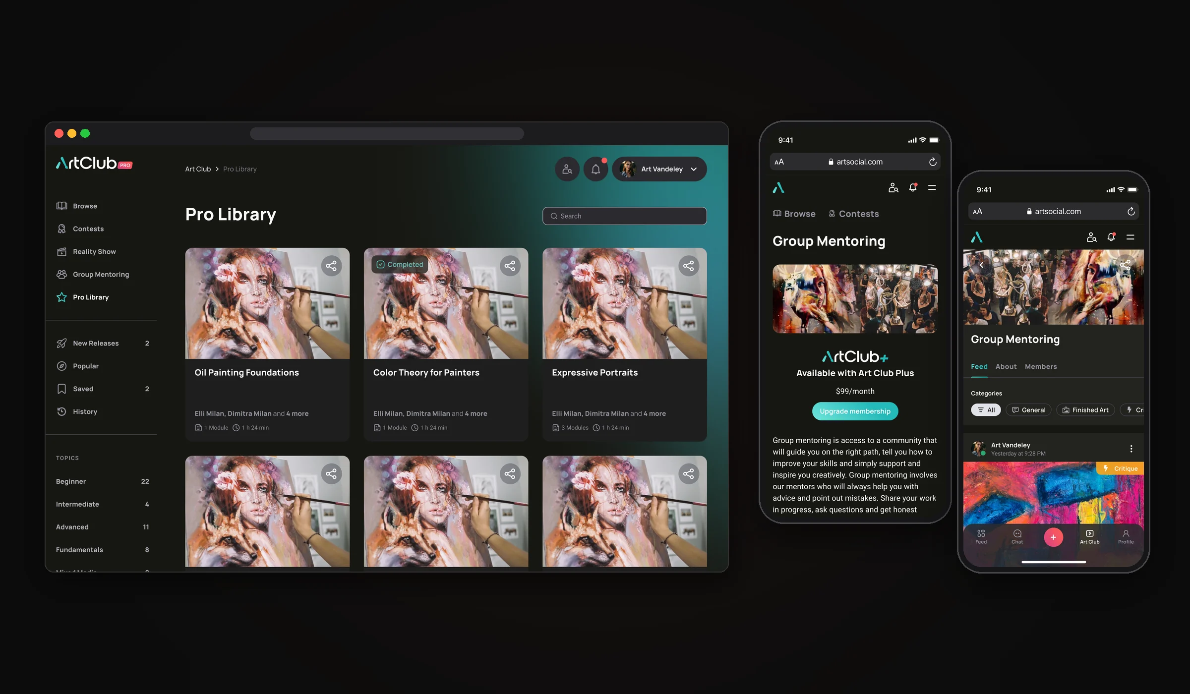
On top of the base club there are paid tiers. Pro Library collects full courses with progress tracking, and Group Mentoring gives members a private community with mentors. When a feature needs a higher plan, we show what it is and the upgrade right there, without leaving the screen.
Joining Art Club
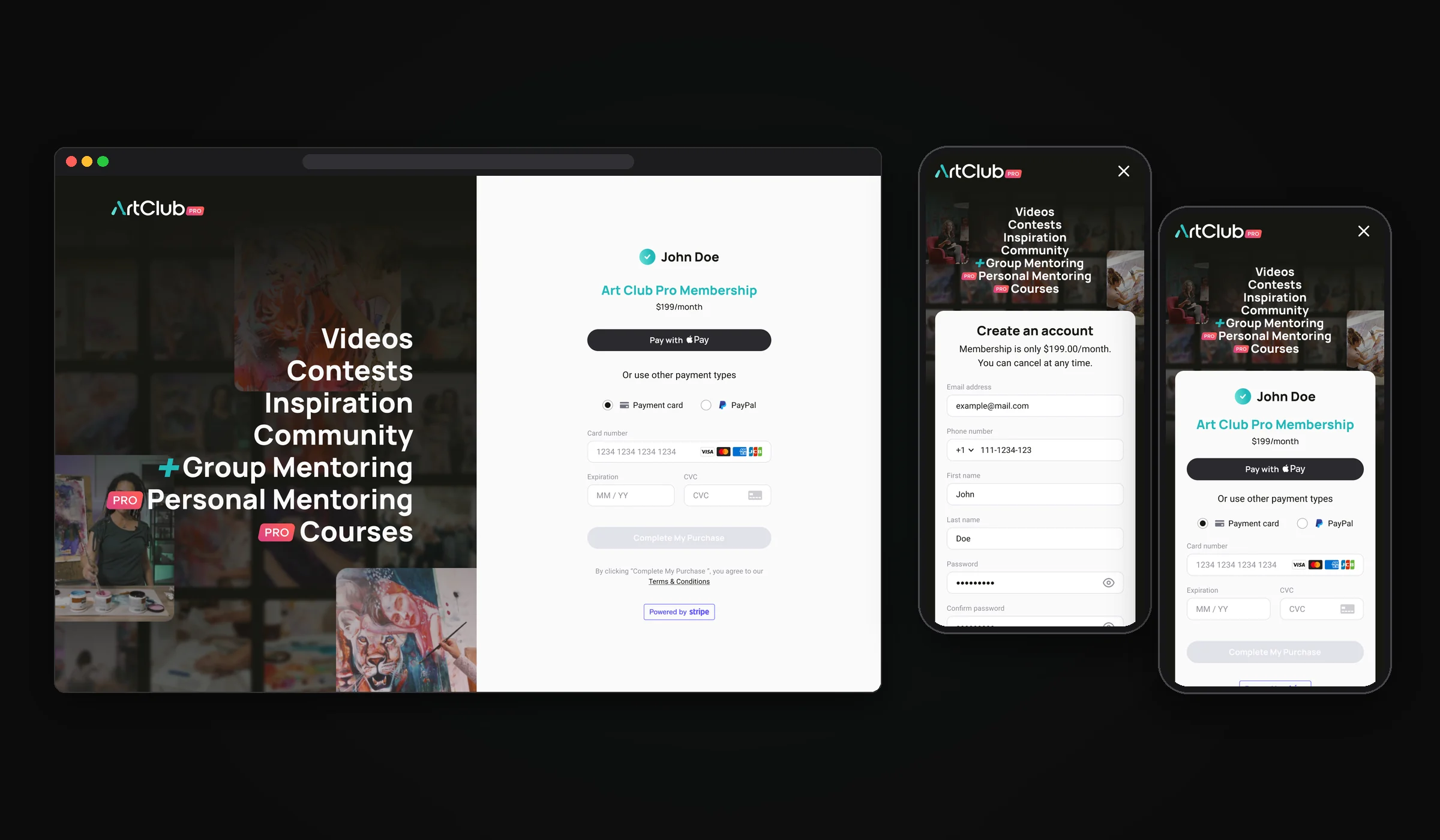
Art Club is a paid monthly subscription, so the checkout had to feel as calm and trustworthy as the rest of the product. The left side keeps selling the club, the right side does only one job. Sign up and payment fit on one screen, with Apple Pay, Google Pay, PayPal or a card through Stripe.
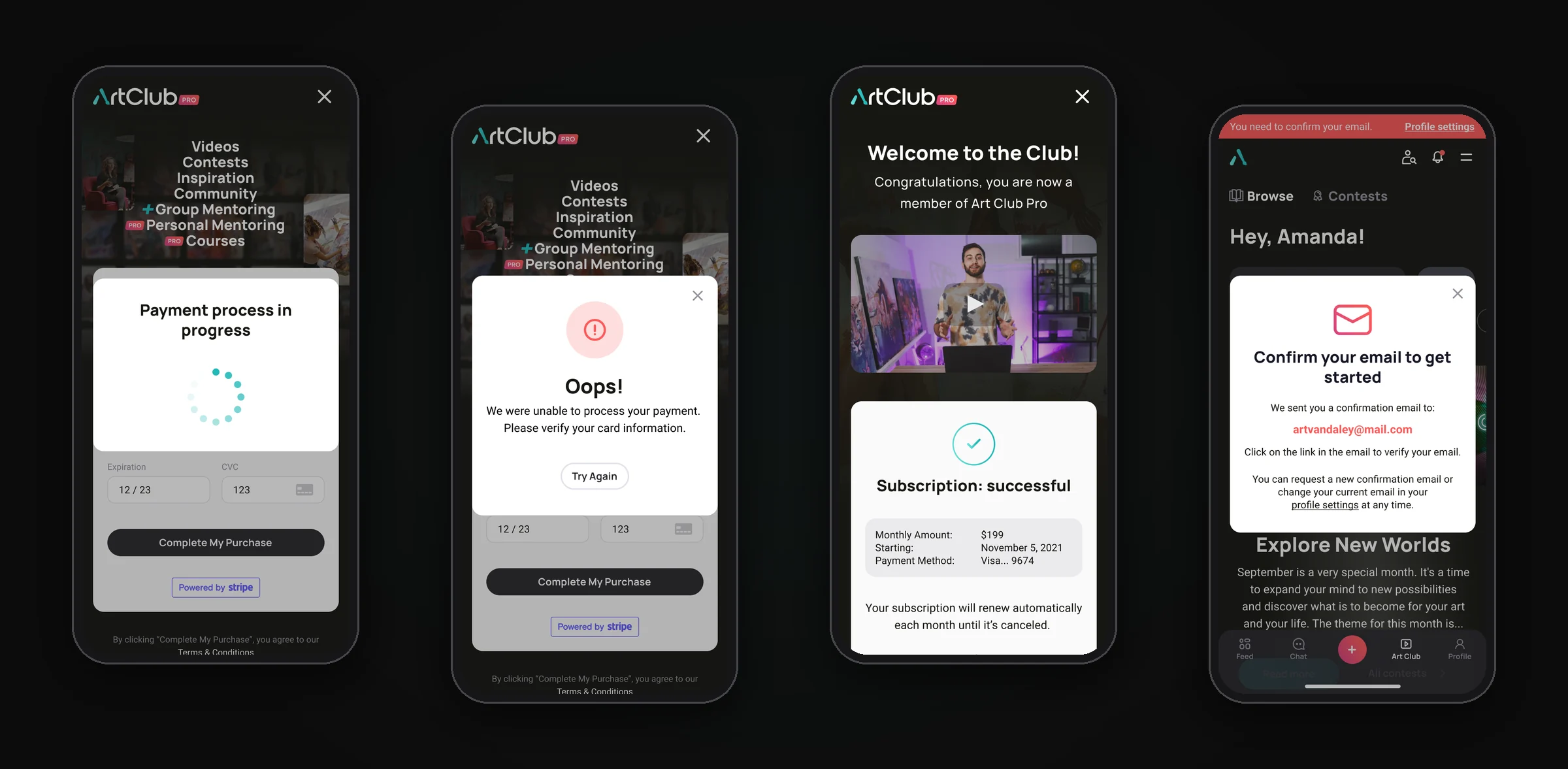
We designed every step after the button too: payment in progress, a friendly error with a way to retry, a welcome screen with a video from the founders and a next step, and a reminder to confirm the email address.
Emails
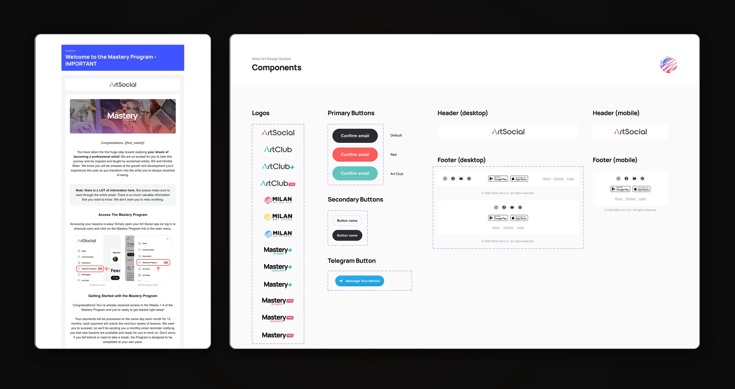
Every email the platform sends, from account confirmation to program onboarding and payment issues, is built from a shared library of headers, footers, buttons and logos, with guidelines for how it renders in real mail clients.
Admin panel
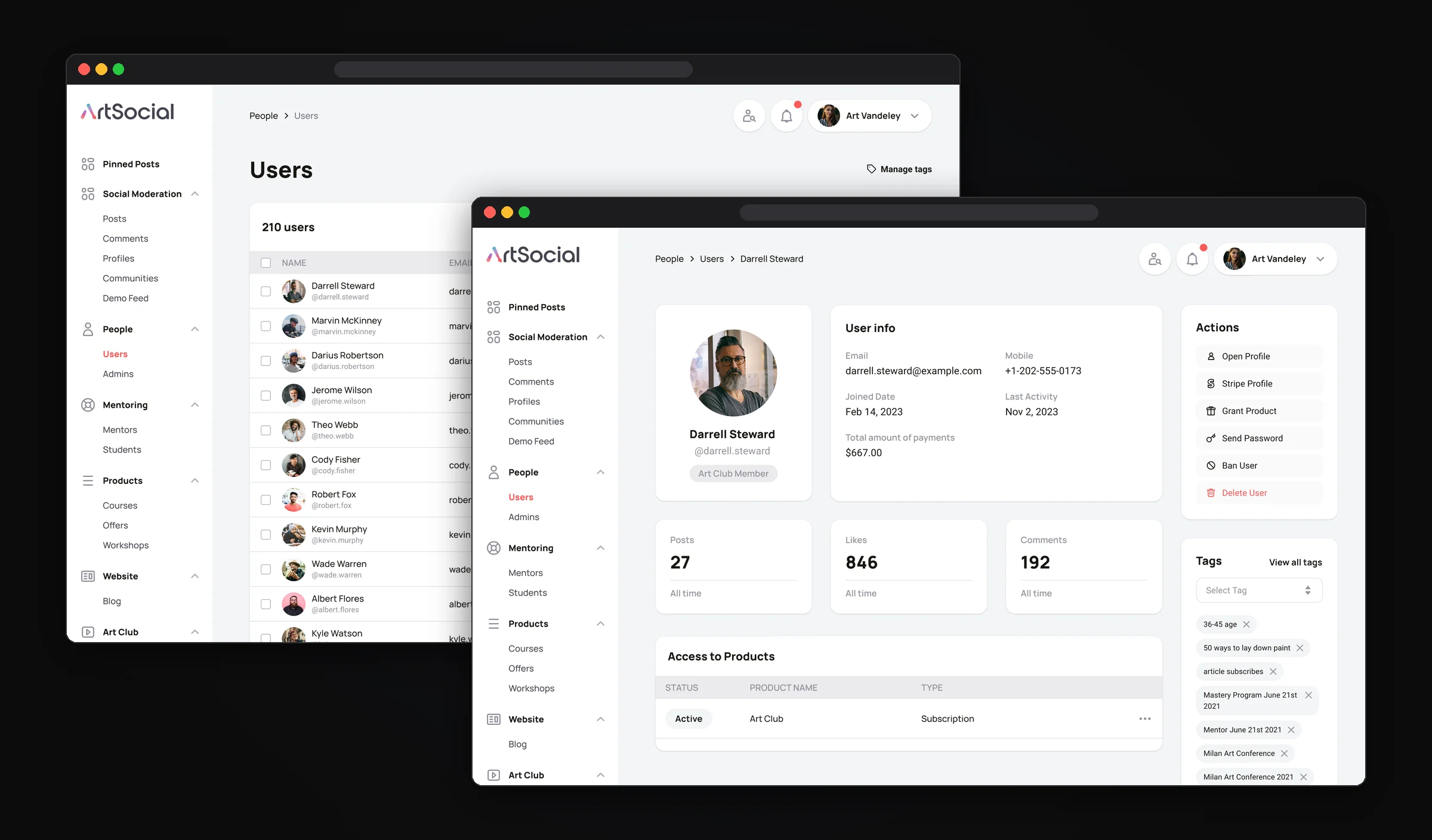
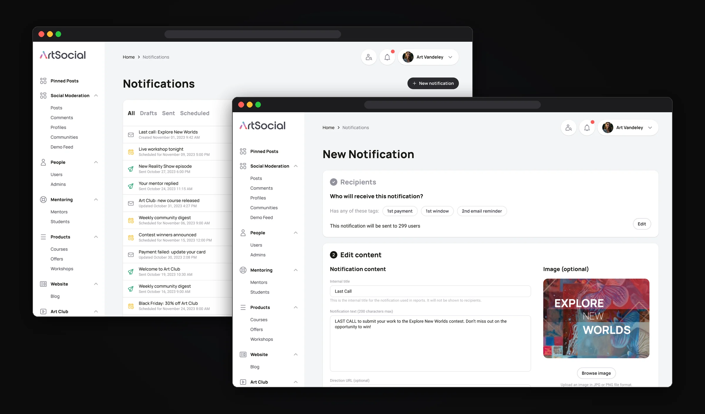
Behind the product there is an admin panel for the team: users and their purchases, tags, mentors with payment statuses, and moderation. We also designed notifications as a four-step flow: choose recipients by tags and roles, write the message, schedule it and send. Each finished step collapses into a short summary, so the admin always sees what goes out and to whom.
From designer to design lead
I joined as a product designer. A year later the company asked me to take over as design lead, and I was introduced to the whole team at the all-hands meeting as the UX design team lead. From then on I led a team of up to 5 designers and worked directly with the CEO and the developers.
As design lead I was responsible for both the team and how design worked with the rest of the company:
- Team. I set priorities, split the work, ran daily stand-ups, helped designers get unstuck, and reviewed every task before it went to development.
- Growth. I mentored the junior designers and helped them grow.
- Product decisions. I discussed plans and solutions with the CEO at company brainstorms, and worked day to day with the Head of IT and the tech lead of the frontend and backend teams.
- Continuous improvement. I regularly gathered feedback from the community and bug reports from QA, turned them into priorities and improved the key flows release after release.
- Hands-on work. I kept the most complex and critical tasks for myself.
Results
In the first six months after the release:
What I took away
This project made me grow a lot as a product designer. I learned to build and maintain large design systems and to keep a product with hundreds of screens consistent as it grew. I got my first real experience leading a product design team of up to five designers: setting priorities, reviewing work and keeping quality steady across the whole team. And working with a US company every day taught me to communicate with the American market: present ideas clearly, defend design decisions with arguments and find common ground with the CEO, developers and the business.