Dapp.Expert — Crypto Media Platform
A crypto media and analytics site about coins, dApps, NFTs and exchanges.
- Role
- Design Lead
- Period
- Feb 2024 — 2026
- Team
- 3 designers

Context
Dapp.Expert is a crypto media platform: news, analytics and rankings of coins, dApps, NFTs and exchanges. It ran alongside DeFight, the browser RPG from the same team.
My role
I led design for Dapp.Expert as Design Lead in a team of three designers: from the brand book and design system to every screen of the product. I owned decisions on the platform’s structure, the library rules and how design reached development.
We worked as one system, not three separate pairs of hands. Every layout was built from one library, every screen went through review, and it reached development with all states, logic annotations and a ready-for-dev mark. We sped up part of the routine, from library audits to handoff prep, with our own AI tools, so the team spent its time on decisions rather than checks.
Identity
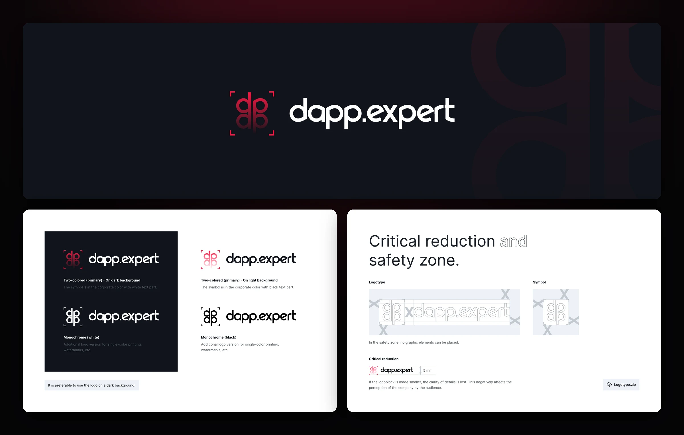
Before drawing interfaces, we put together a brand book. The “dp” mark in corner brackets resembles a viewfinder: the platform brings the crypto market into focus. The logo has two-color and monochrome versions for dark and light backgrounds, and the clear space and minimum size keep the mark from getting lost in a header or on a banner.
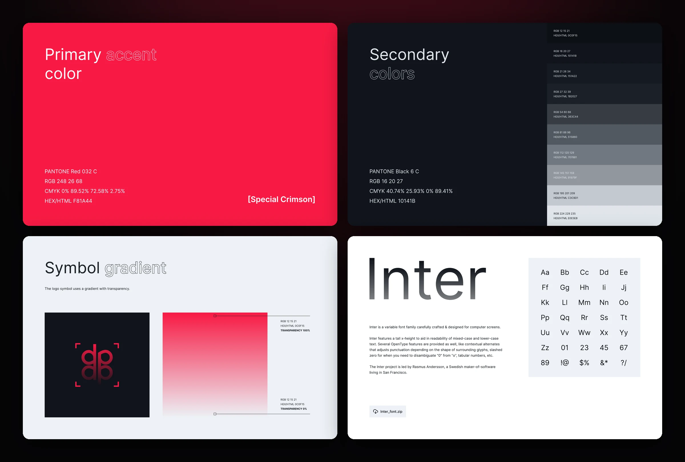
The palette rests on one bright accent, Special Crimson #F81A44, and a scale of deep dark shades. The mark got its own gradient from the accent to transparent, and all typography is built on Inter. The brand book and the design system share the same colors, so the site, banners and social media look like one product.
Design system
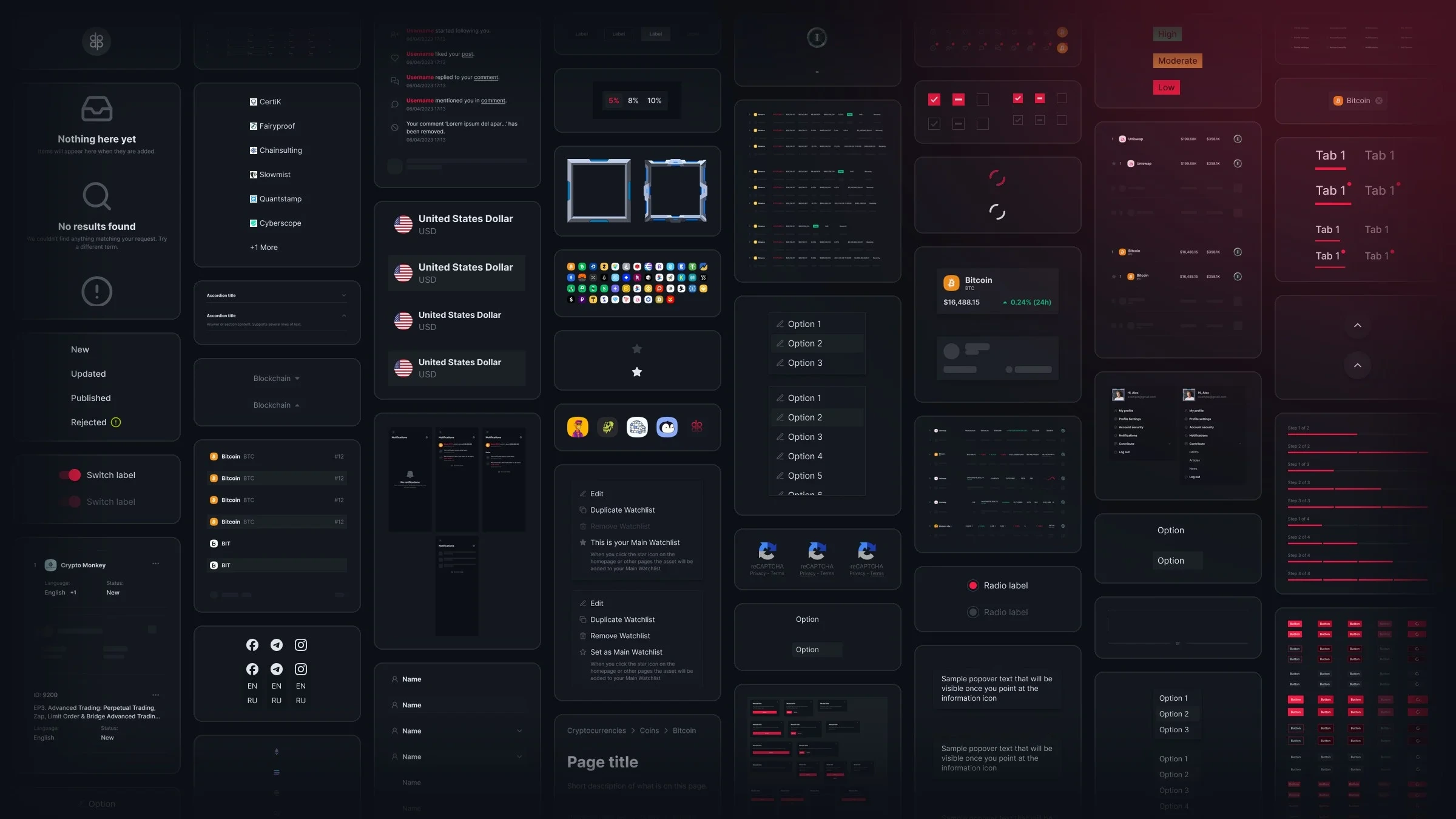
The product lives on data: tables with a dozen columns, prices that update every second, news feeds and ad blocks. To hold it all together, we built one library for the whole platform: from buttons and inputs to ranking tables, news cards and ready-made page templates.
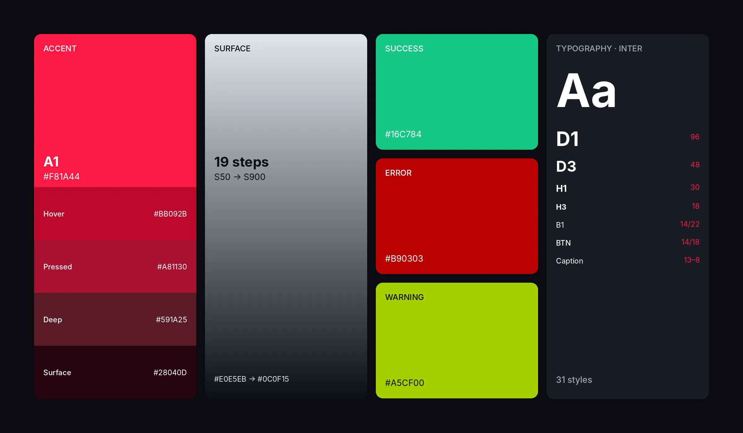
A dark theme with one bright accent: red A1 draws the eye to the main actions, and a 19-step neutral scale separates background, cards and tables by depth. Green and red show price going up and down, which is the main language of the interface for a crypto audience. Typography is Inter: from large Display headings to small Caption for dense tables.
Every component has all its states: hover, pressed, disabled and loading, and tables and cards got skeletons while data loads. Page templates are built in three breakpoints (1440, 768 and 360), so the site holds up equally on desktop, tablet and phone.
Home
The home page gathers everything people come to the platform for on one screen: fresh news, the market ranking, articles and a subscription. Above the whole site runs a strip of live stats: the number of dApps, blockchains, active users and 30-day volumes. Guests and logged-in users see different versions of the page, and we laid out every block for desktop, tablet and phone.
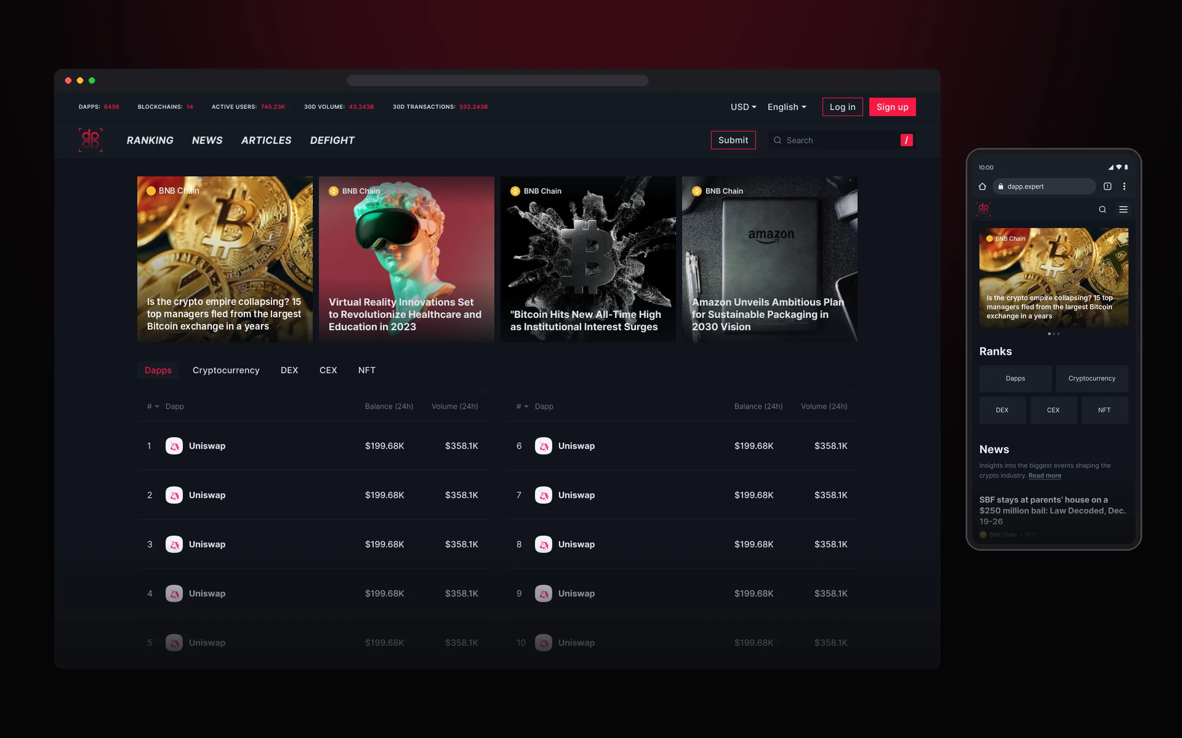
The first screen is an editorial showcase of top news, with a short market ranking below it and tabs for Dapps, Cryptocurrency, DEX, CEX and NFT.
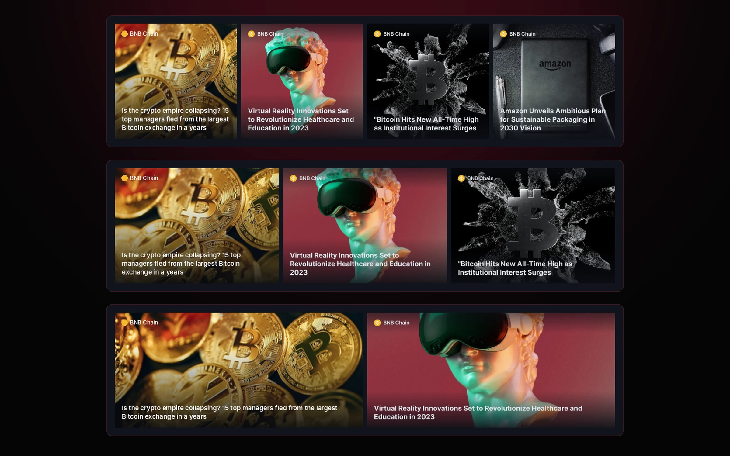
The number of top stories varies, so we made the hero flexible: four, three or two cards, and the grid always looks complete.
Rankings
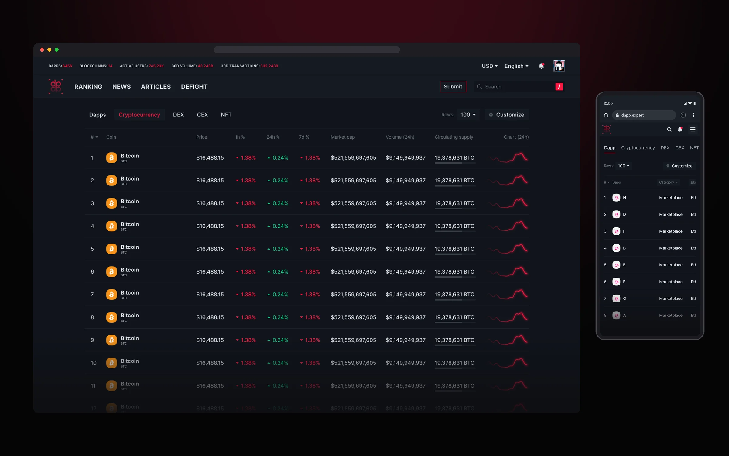
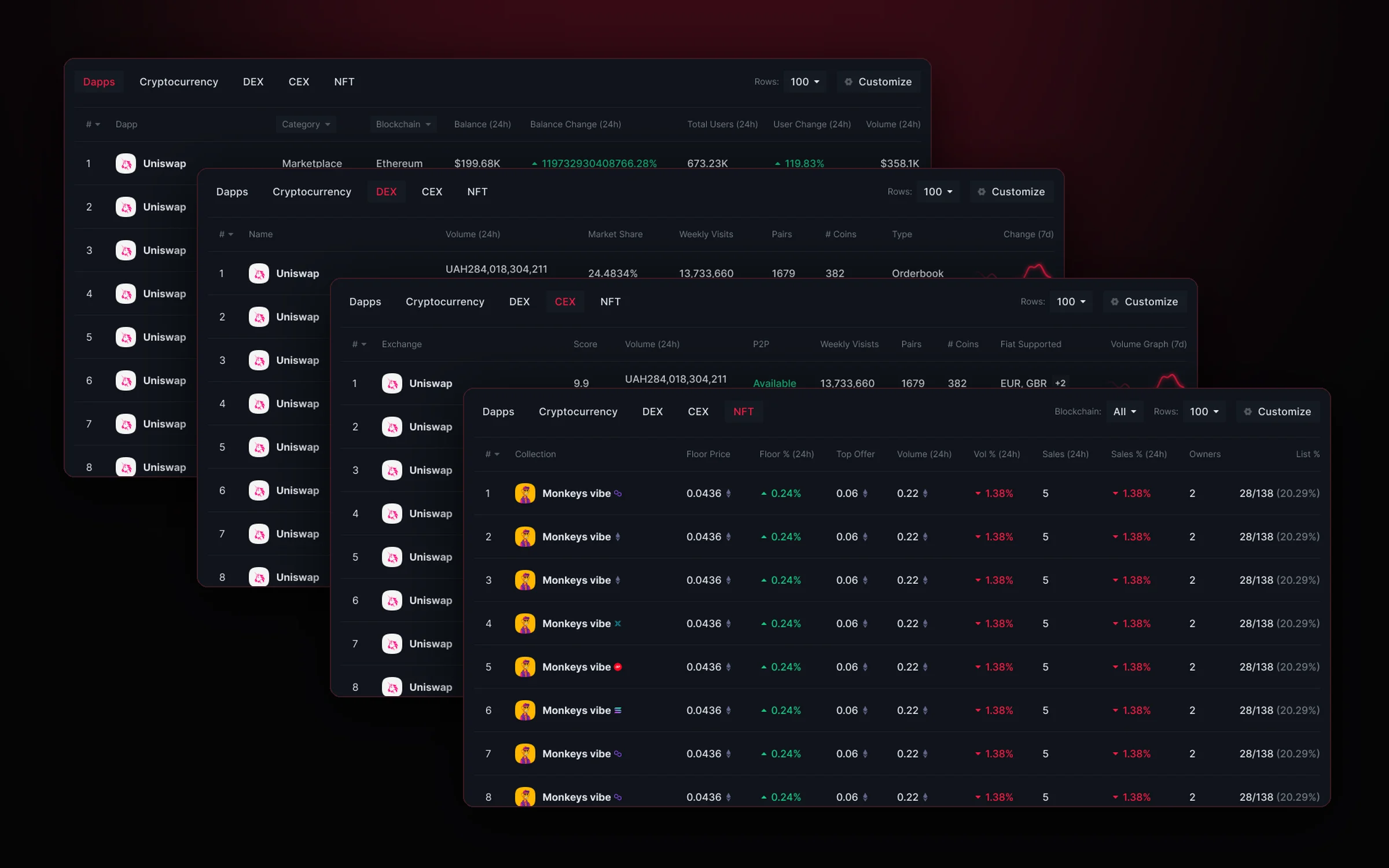
Rankings is the heaviest page of the platform and the heart of its analytics. Five tabs (Dapps, Cryptocurrency, DEX, CEX and NFT) work as five separate tables: each asset type has its own metrics, from coin price and market cap to the floor price of NFT collections. A table shows up to a hundred rows, and when there are more columns than the screen fits, it scrolls horizontally with the first columns pinned.
One frame for five different tables: tabs, blockchain filter, row count and Customize always stay in place. Switching between asset types doesn’t make you reorient.
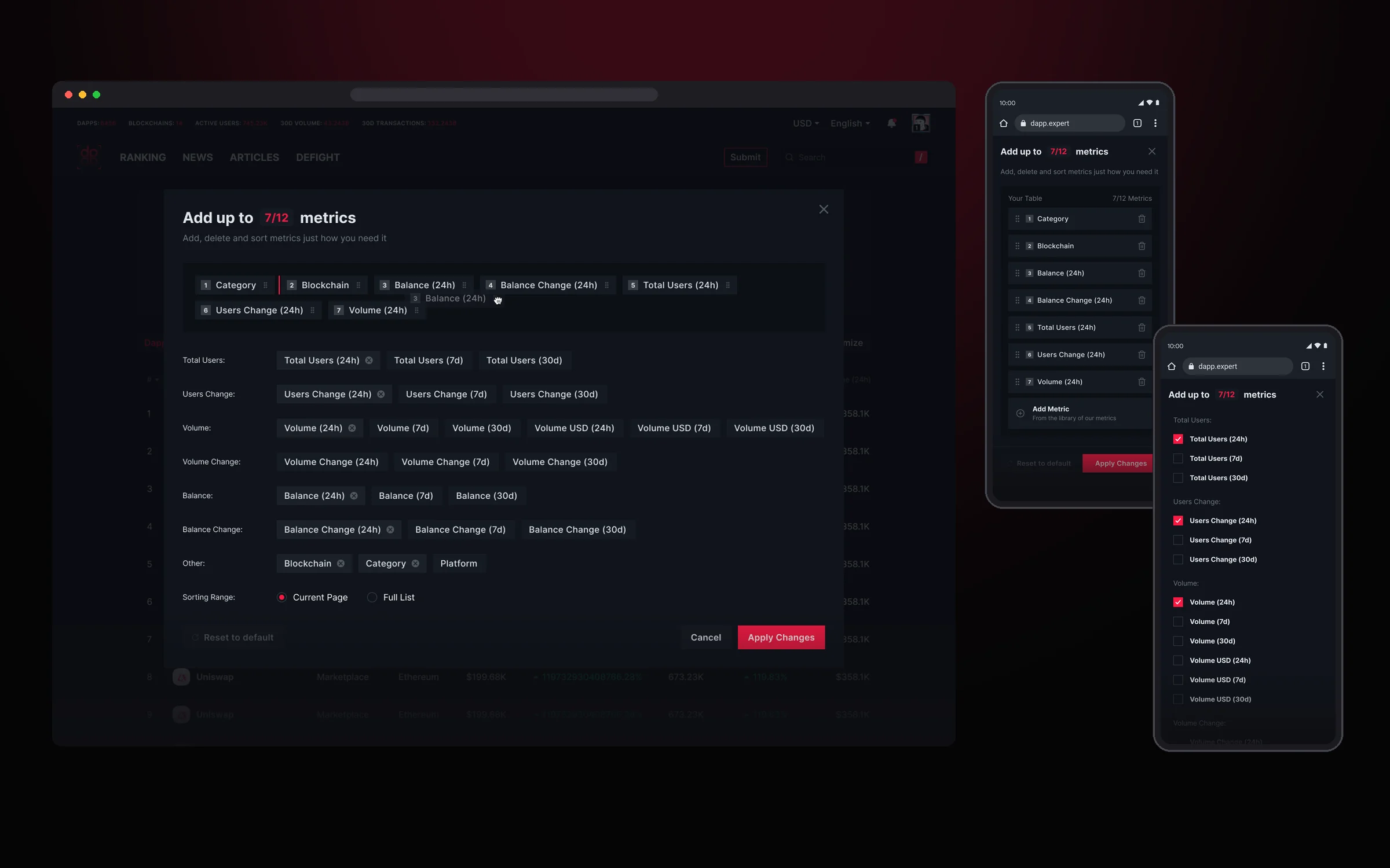
Everyone builds the table for themselves. In Customize you can pick up to 12 metrics from the library, drag them into the order you need and reset everything to default with one button. We also thought through the limits: a cap on metrics and no way to turn off the last column.
Coin page
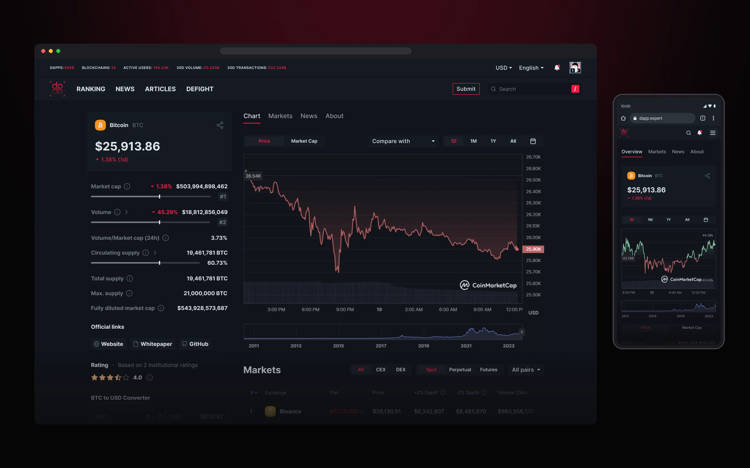
The coin page gathers everything about an asset on one screen: price and key metrics on the left, a chart with comparison and periods in the center, and exchanges, news and description below. On mobile the same blocks are split into Overview, Markets, News and About tabs.
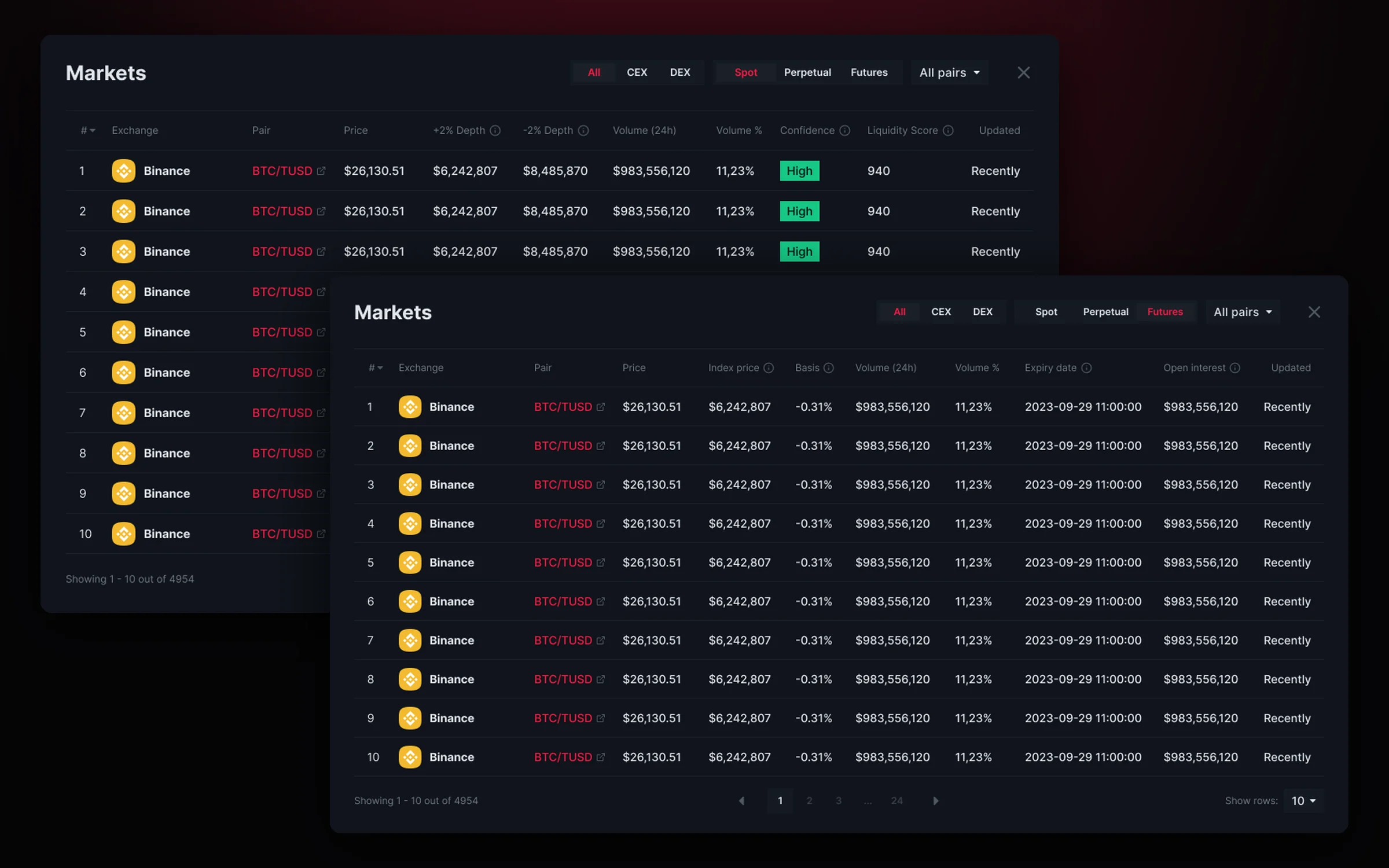
Markets opens full screen when you need the details. Spot, Perpetual and Futures have their own columns, from market depth to expiration date, and the CEX/DEX and pair filters work the same for all of them.
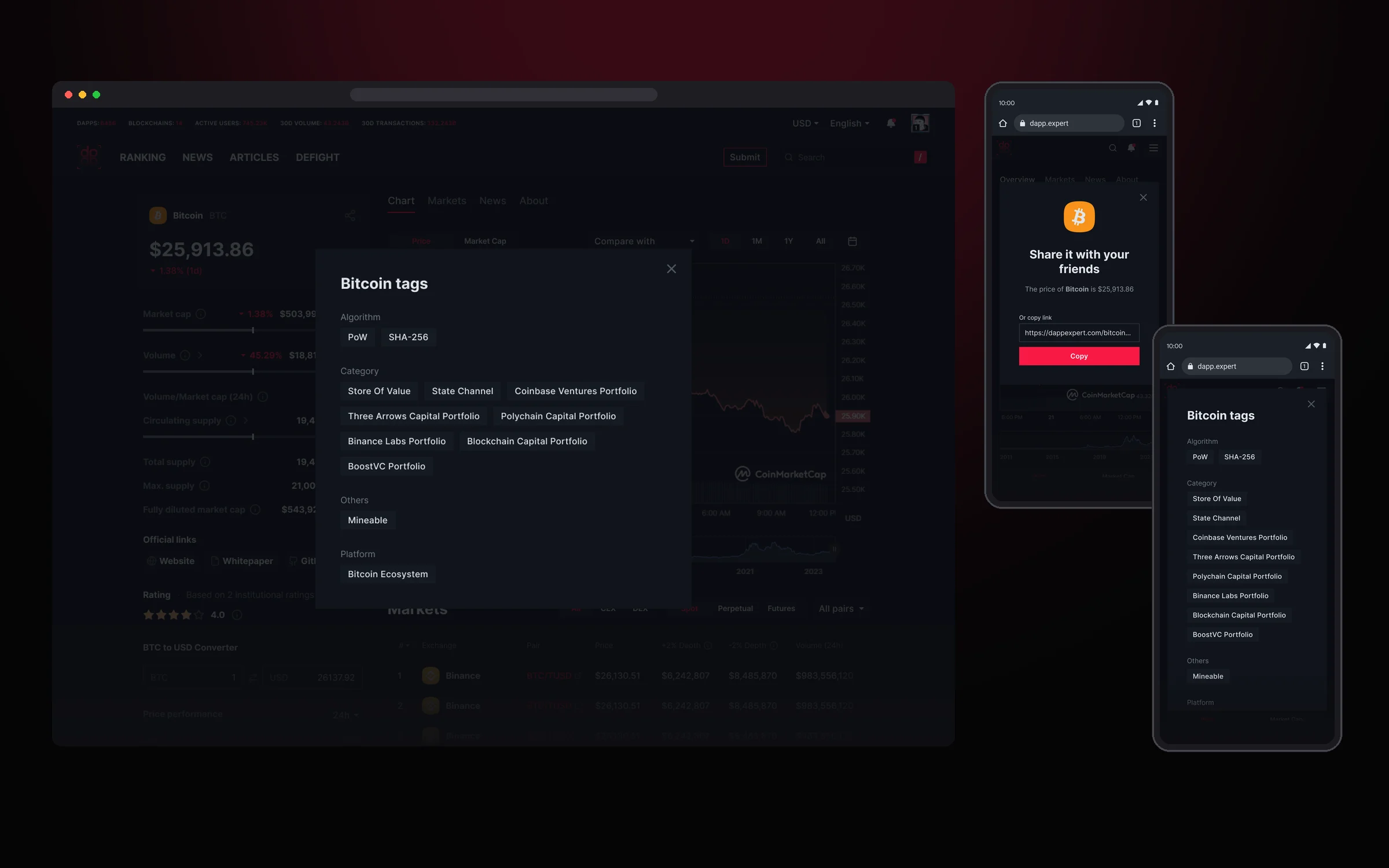
The small things are thought through too: asset tags are grouped in a separate popup, and the price can be shared in one tap.
NFT page
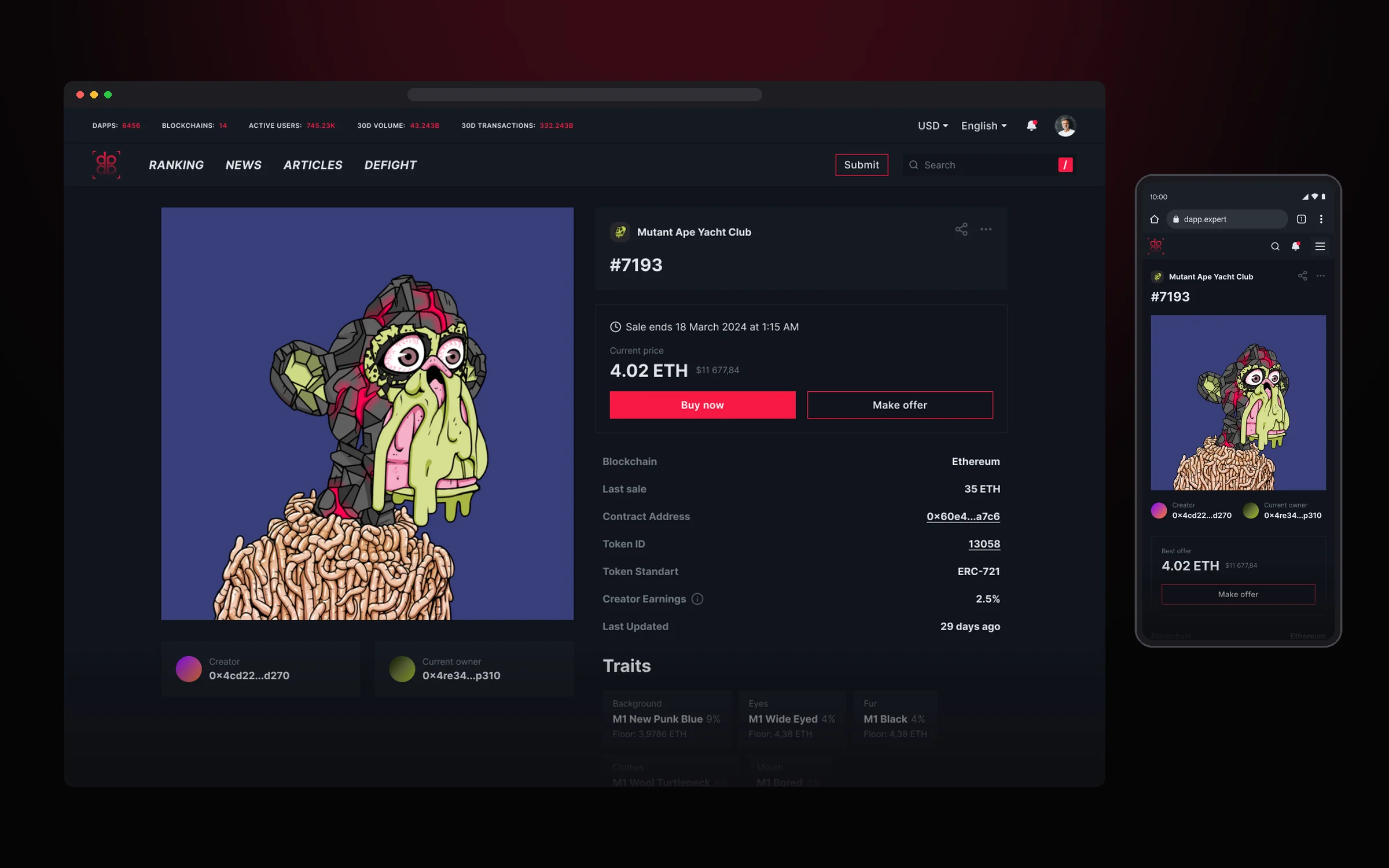
The NFT page keeps the token itself at the center: a large image on the left, the collection, price and technical details on the right, traits and price history below. On mobile it’s the same order in one column.
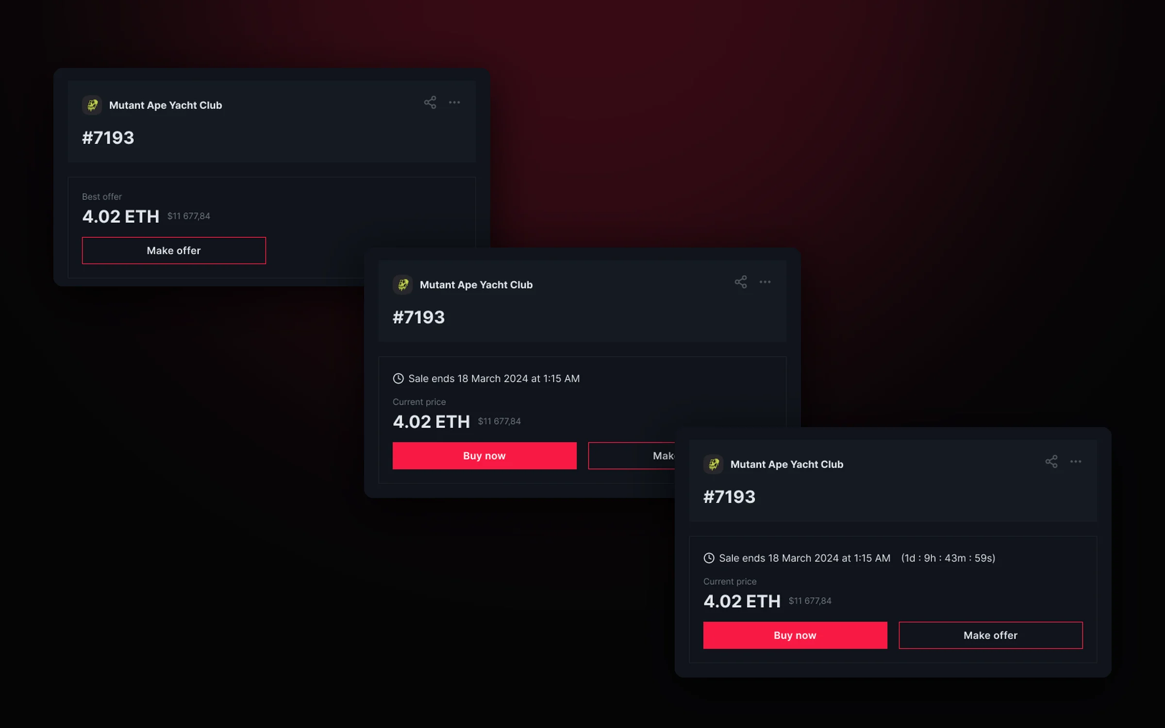
The price card changes with the token’s status: the best offer when the NFT isn’t for sale, Buy now when it’s listed, and a countdown to the end of an auction.
Search and notifications
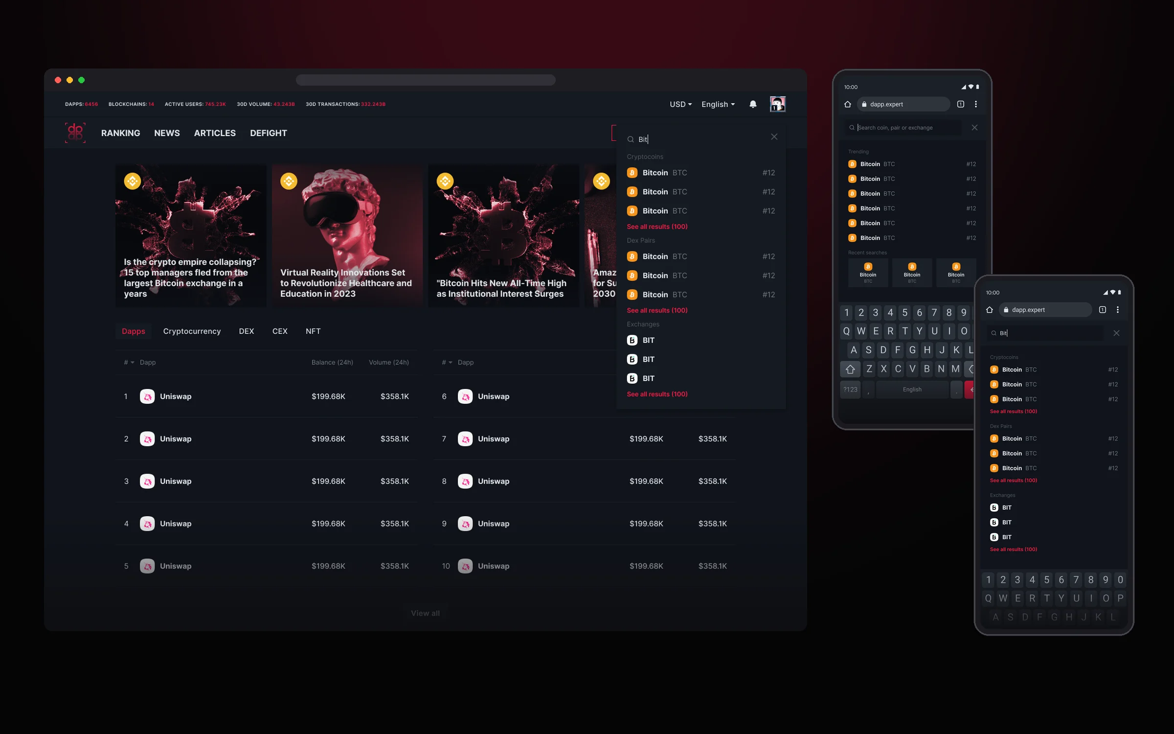
Search opens from any page and helps right away: before you type, it shows trending coins and recent searches. Results are grouped by type: coins, DEX pairs and exchanges, three in each group with a link to the full list.
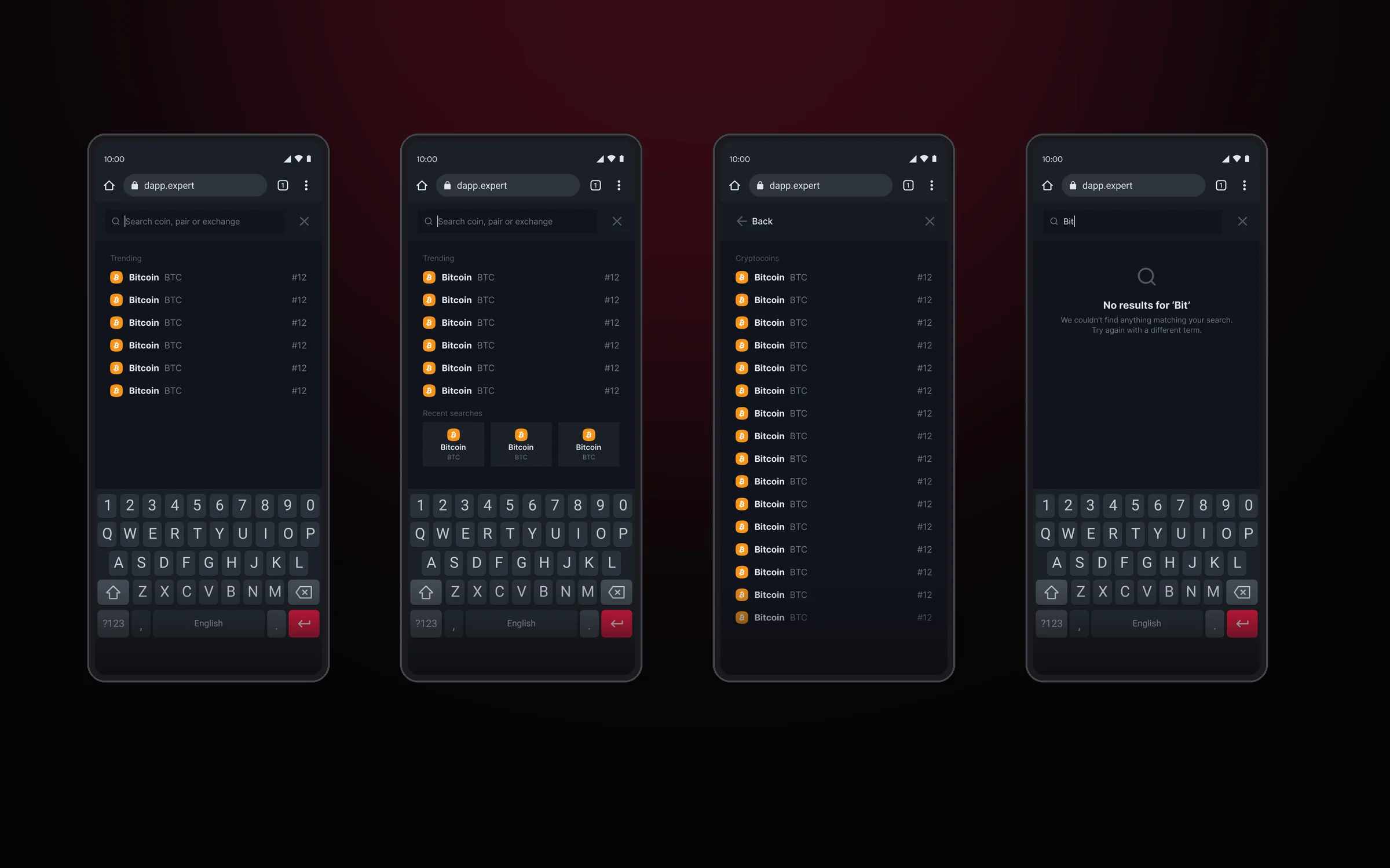
On mobile, search takes the full screen and goes through the same states: trends, recent searches, the full group list and an empty result with a hint on what to do next.
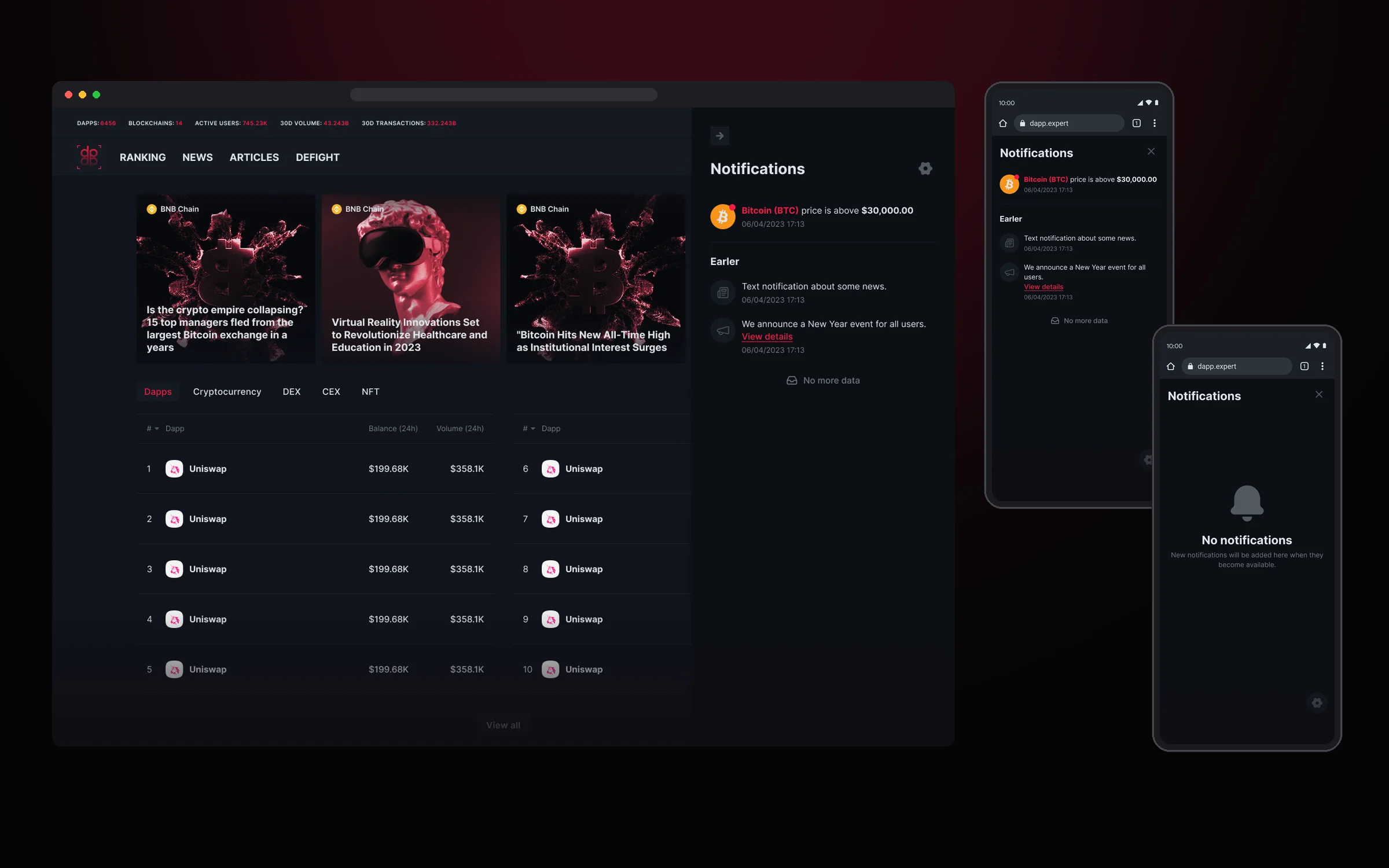
Notifications open in a side panel and don’t take you away from the page. New events sit on top, the rest go to “Earlier”. The type is clear from the icon: a price alert, a news story or an announcement. An empty list has its own state, and on mobile the panel opens full screen.
News and articles
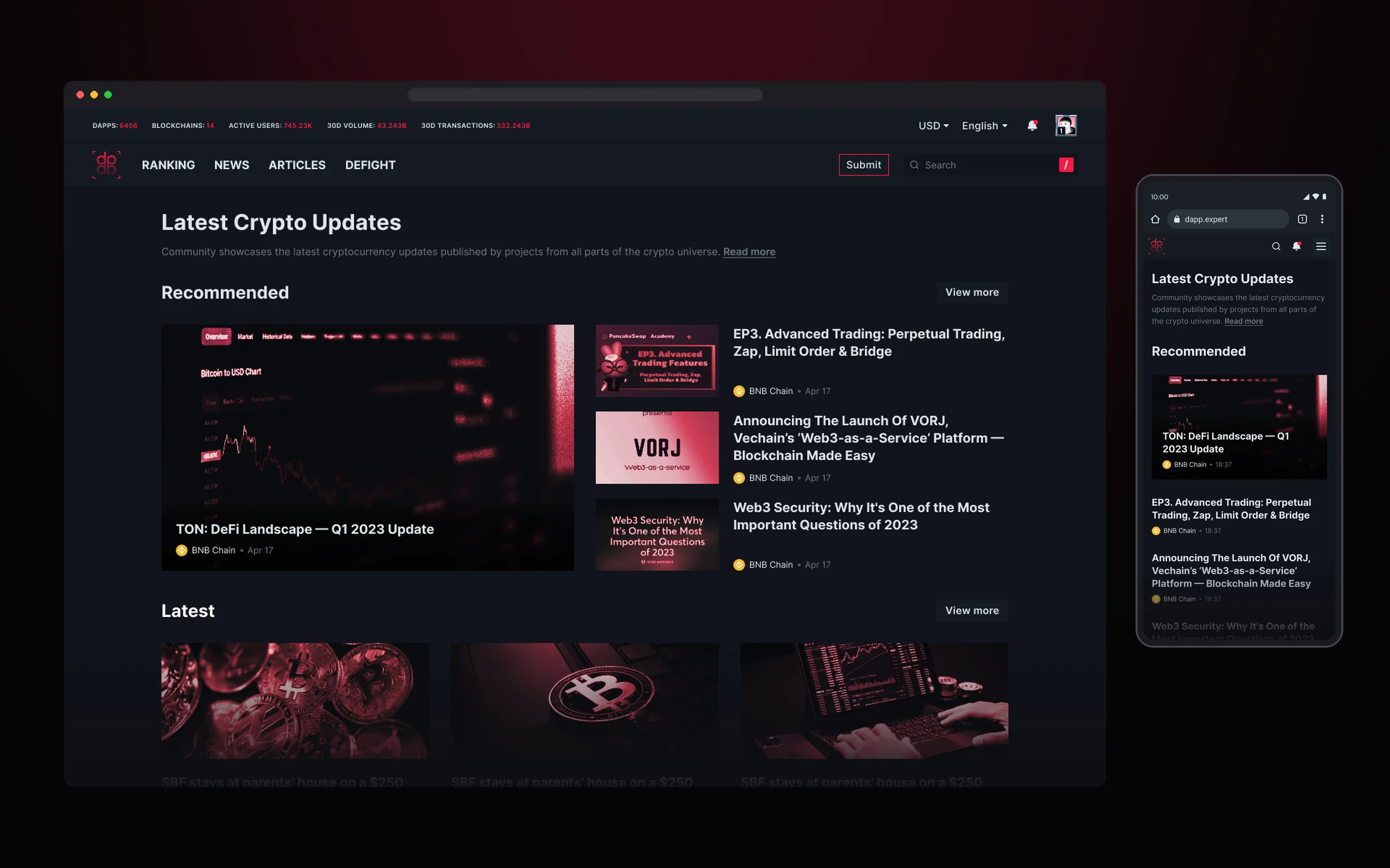
News and articles share one template: a feed with featured and latest items, category tabs and the same content card. This way the editorial team publishes both formats without separate designs, and readers don’t feel a difference between sections.
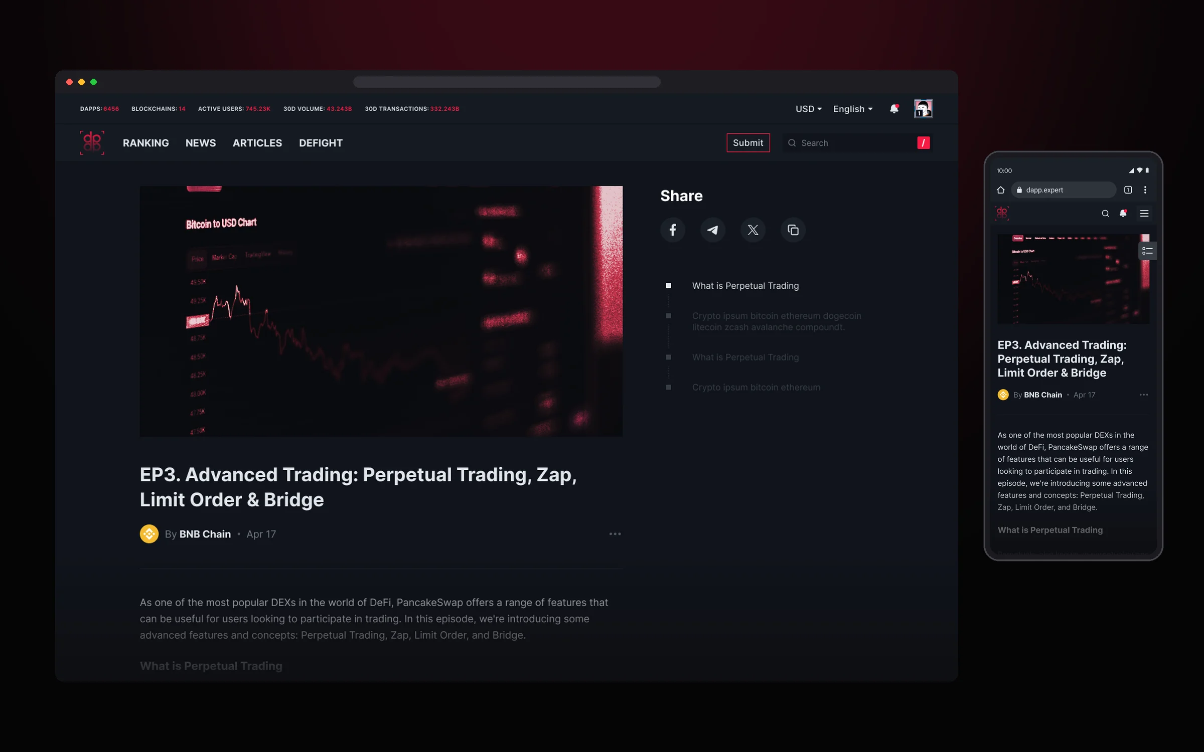
The article page is made for long reads: a table of contents to navigate long text, a Share button and a menu of extra actions at hand on desktop and mobile.
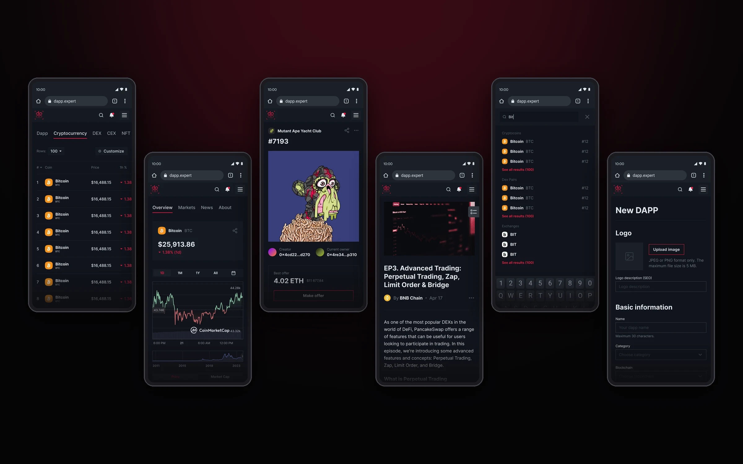
On mobile, every section has a life of its own rather than being a squeezed copy of desktop: tables got their own navigation, asset pages are split into tabs, and forms are broken into short steps.
Advertising
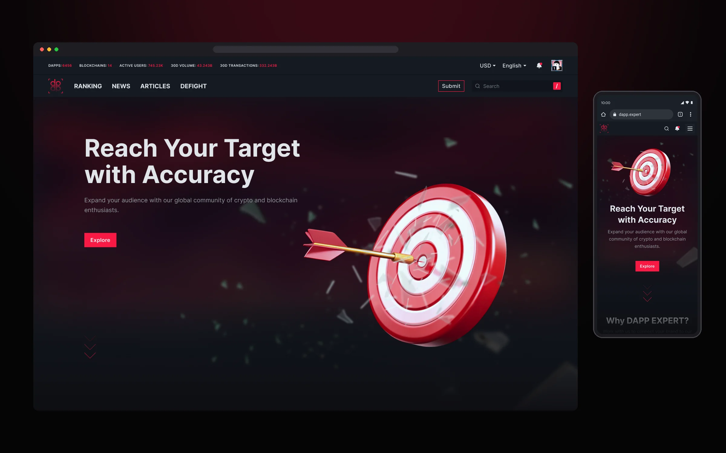
The advertising section sells the platform’s audience: a first screen with one call to action, then audience numbers, demographics and partnership formats.
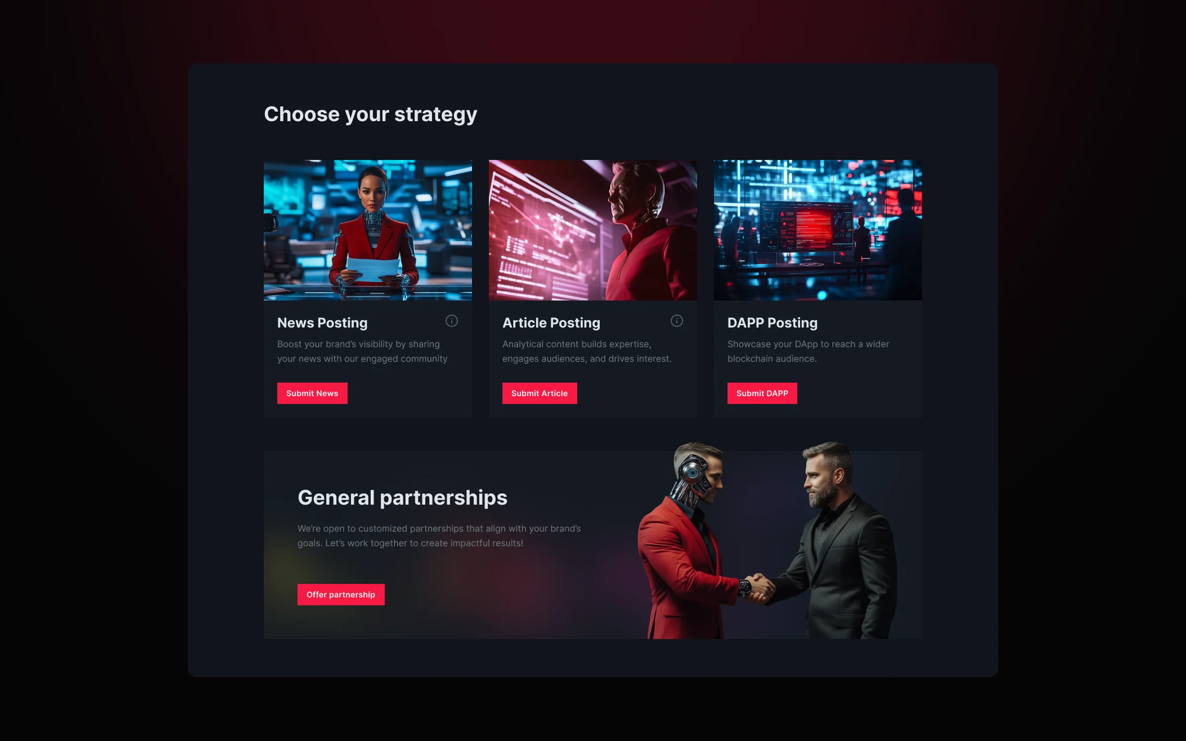
Each format leads to its own form: placing a news story, an article or a DAPP. Custom requests have a separate partnerships block.
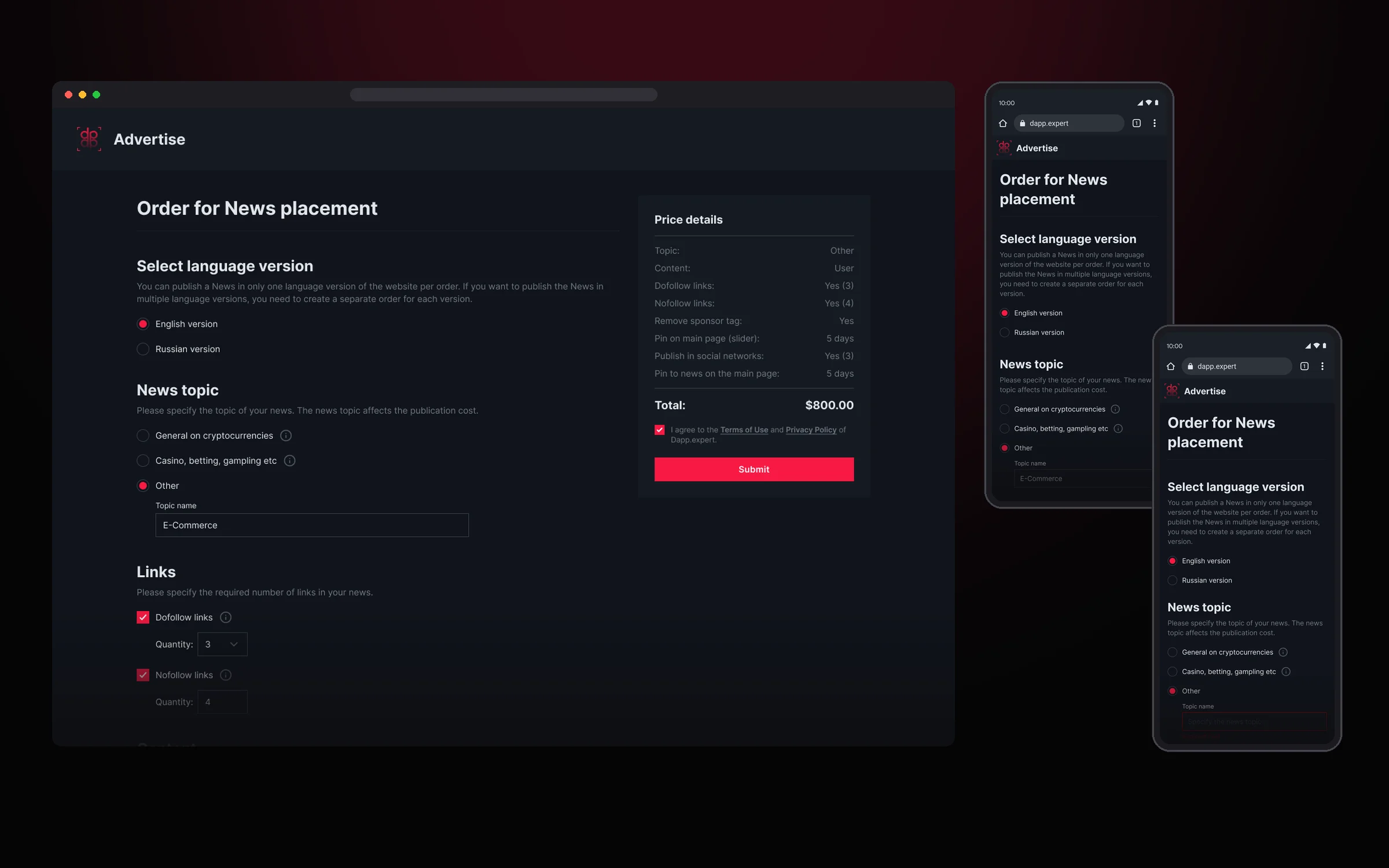
The order form calculates the price itself: selected options instantly appear in a pinned Price details block, so the advertiser sees the total before submitting.
Profile and community contributions
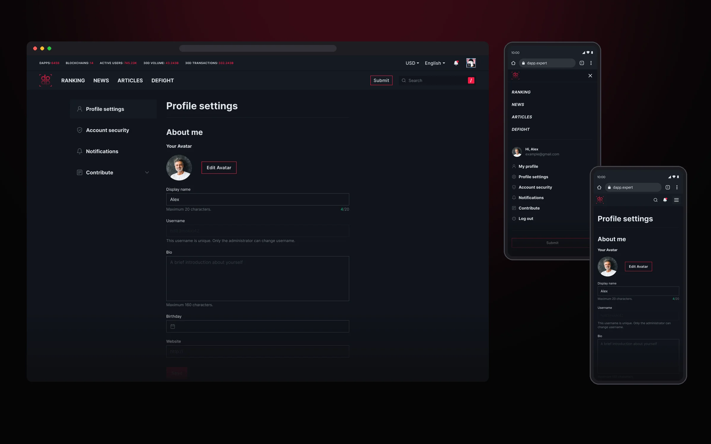
The user account is built around a side menu: profile settings, account security with email, wallet and two-factor authentication, notifications and the Contribute section. On mobile the same items live in one menu under the avatar.
Through Contribute, users add DAPPs to the platform themselves. The form collects the logo, category, blockchain, links and languages, and the list shows the status of every submission: New, Updated, Published or Rejected.
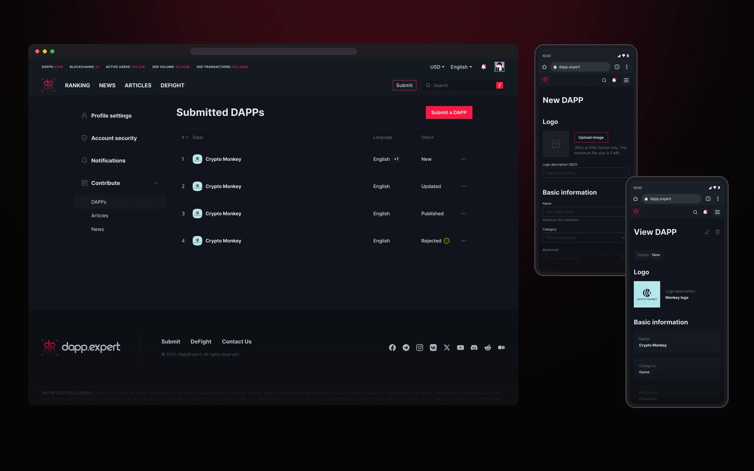
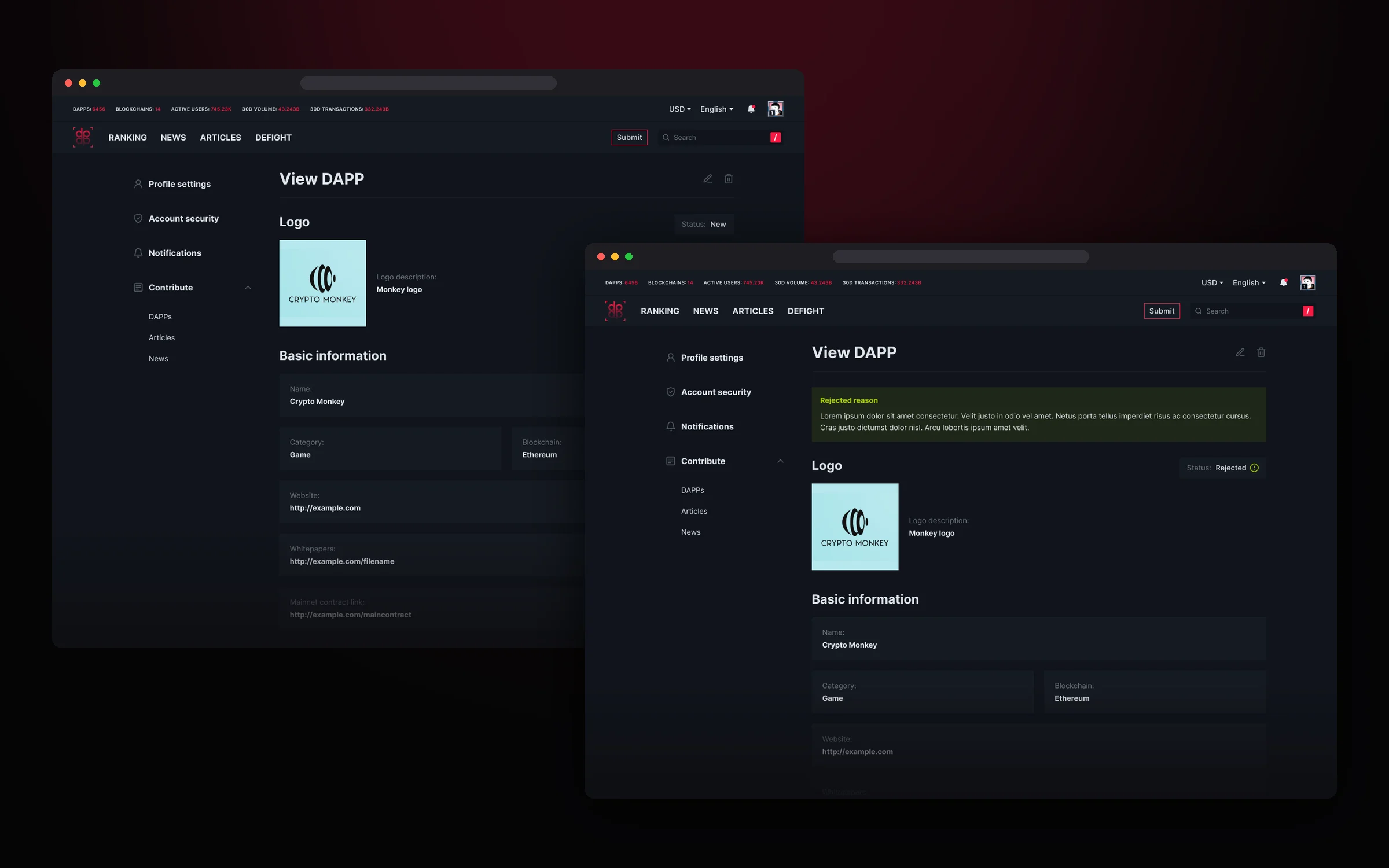
Moderation is transparent for the author: the submission card shows its status, and if it was rejected, the reason too.
The community writes articles the same way: cover, language, title and text in one form.
Sign-in and sign-up
A crypto media audience is mixed: some are used to email and password, others only sign in with a wallet. So we made three equal ways to sign in: email, Google and a crypto wallet. The first screen welcomes newcomers, and returning users get a compact modal with nothing extra.
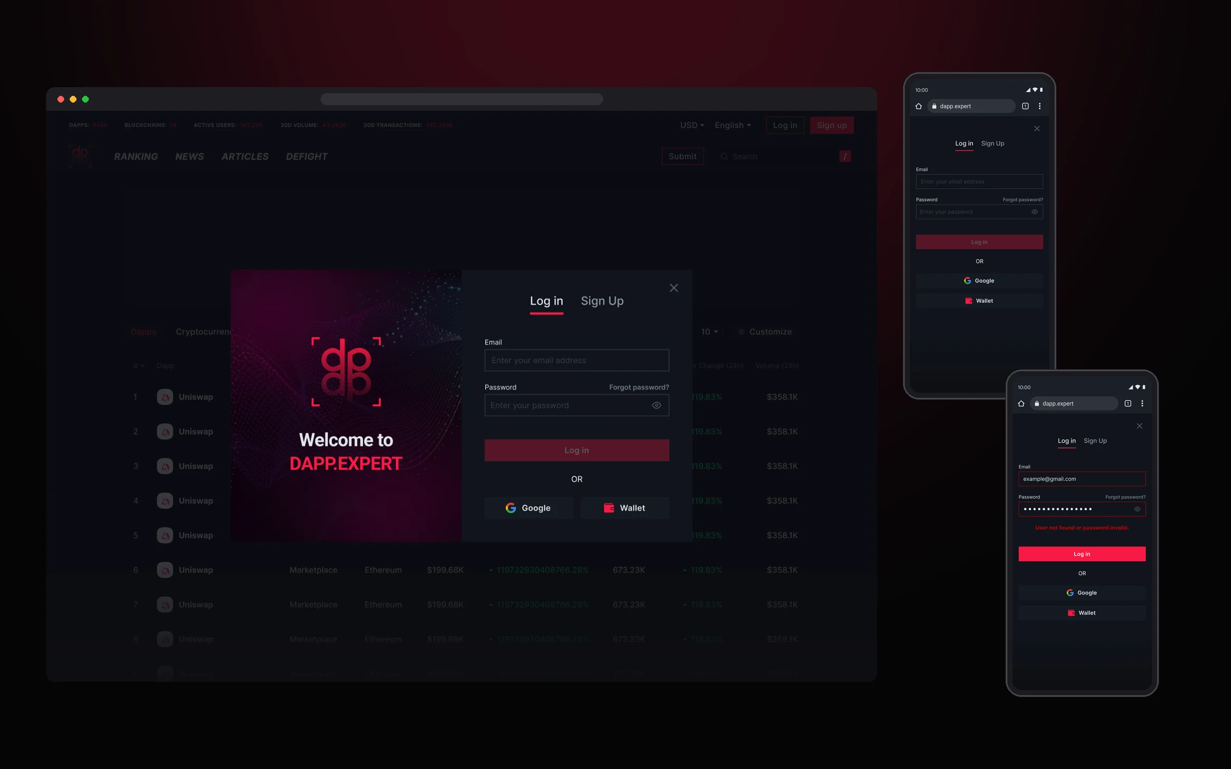
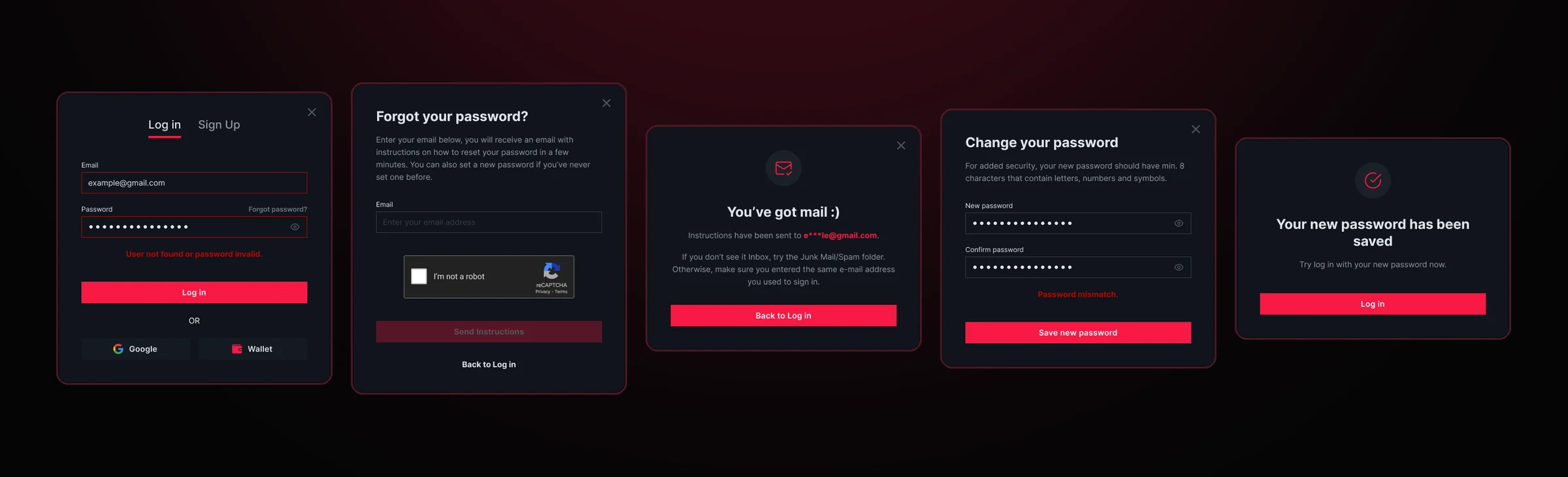
Password recovery works without support: an email with instructions, a new password with a match check and a confirmation that everything is saved. Every error explains what happened and what to do next.
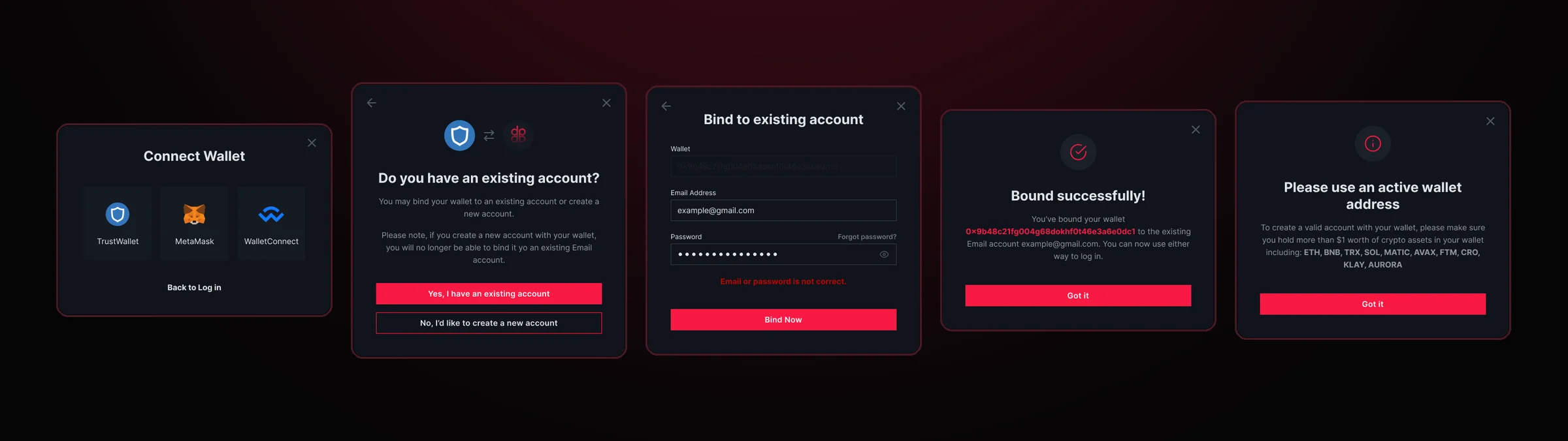
The most interesting part is wallets. After connecting TrustWallet, MetaMask or WalletConnect, the user chooses: link the wallet to an existing account or create a new one. We covered the edge cases too: if the wallet is empty, the platform explains that it needs an active wallet holding at least $1 in assets.
Wallet sign-in
- 01Connect TrustWallet, MetaMask or WalletConnect
- 02Is the wallet already linked to an account?YesSigned in right awayNoLink it to an existing email accountOr create a new account: requires at least $1 in assets
- 03Confirmation and a ready profile
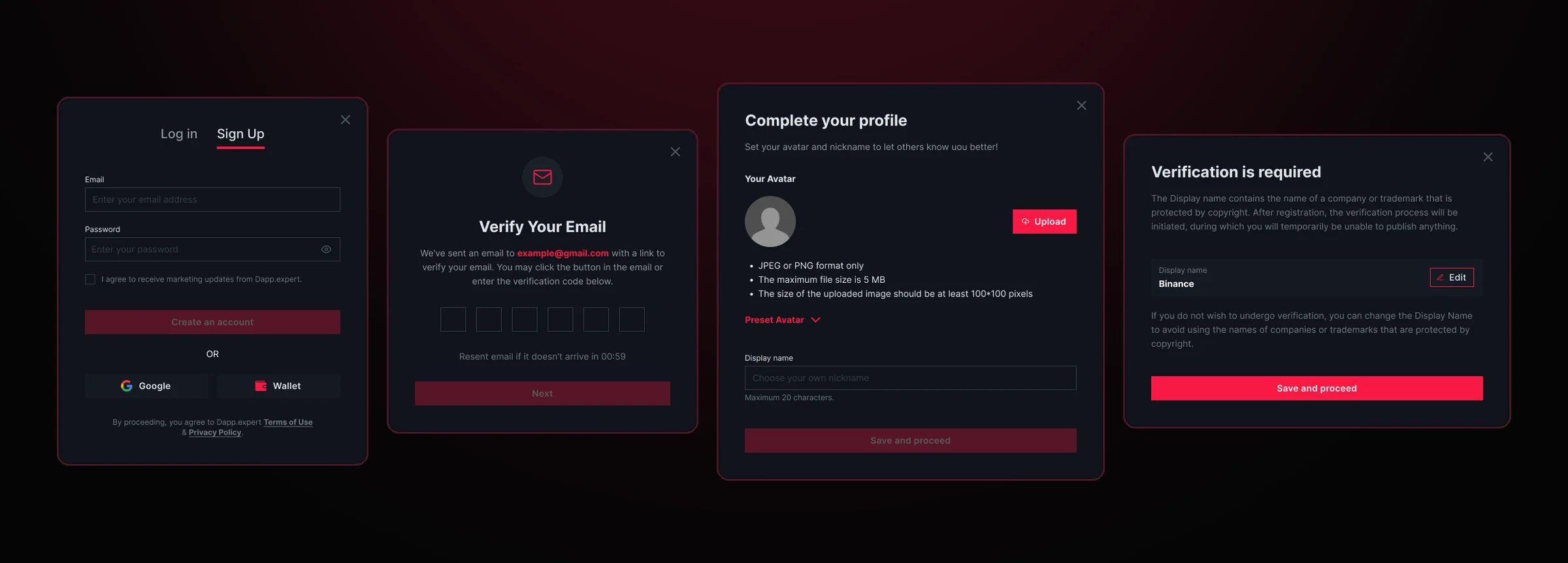
Sign-up doesn’t end at the password: users confirm their email with a code, then add an avatar and a name.
If the name matches a protected brand, such as an exchange name, the account goes to verification. This way nobody can pose as a well-known brand and mislead the community.
Results
Dapp.Expert went from a brand to a full product that ran in production alongside DeFight.
In two years we built a platform where the editorial team, the community and advertisers work in one interface.
- 01 One brand The brand book, design system and product share the same colors and fonts, so the site, banners and social media look like one whole.
- 02 A system, not a set of screens 172 sets and 1,085 component variants with states and skeletons: new pages are assembled from ready-made parts.
- 03 The whole product 12 sections, from rankings and asset pages to advertising and wallet sign-in, in three breakpoints.
What I took away
Dapp.Expert taught me to design a product that lives on data: dense tables, real-time prices and dozens of states that have to stay readable on a phone. Once again I saw that a strong design system pays off by the second section: we spent time on decisions, not on redrawing buttons. And one more thing: in crypto, trust matters more than looks, so transparent moderation, clear errors and protection from fake accounts were as important to us as the visuals.